Night Photography
Mood Board For Inspiration
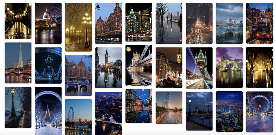
Having lived in London all my life, I have always found its metamorphosis from day to night quite exhilarating, along with that of other global cities I have visited such as Los Angeles, Paris and Beijing. I have chosen to focus on night photography to explore the unique challenges of shooting in low light while at the same time capturing hidden depths and otherworldly beauty. The artists that have particularly influenced me in this project include Thierry Cohen, Dan Marker Moore, Fong Qi Wei, Carl Anthonyn Dufault, Richard Wilson, Paul Reiffer and Simon Bond. I will take inspiration from their body of work and merge their ideas for my own personal interpretation.
|
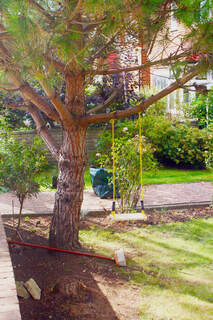
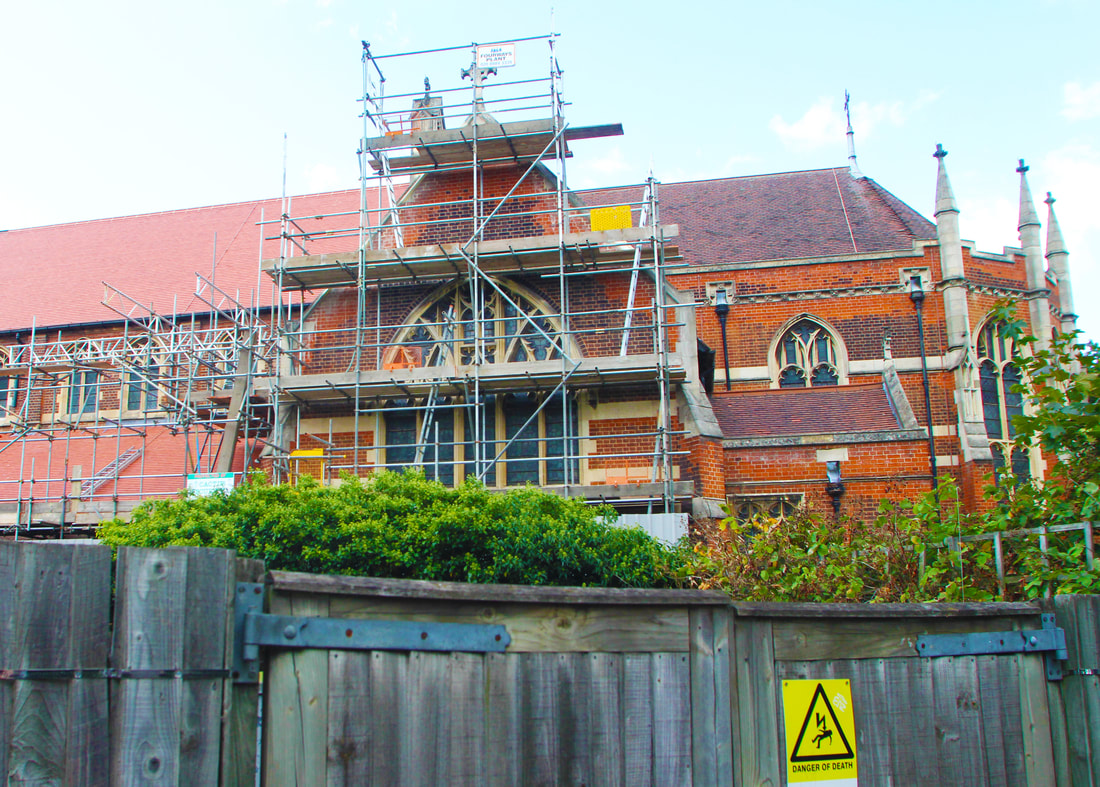
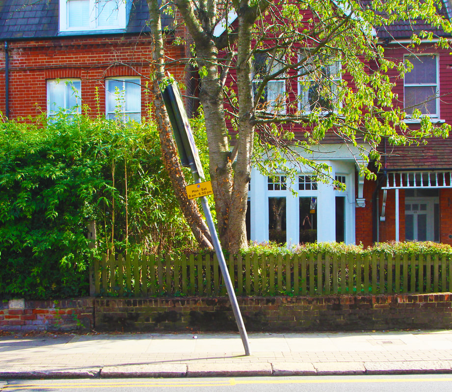
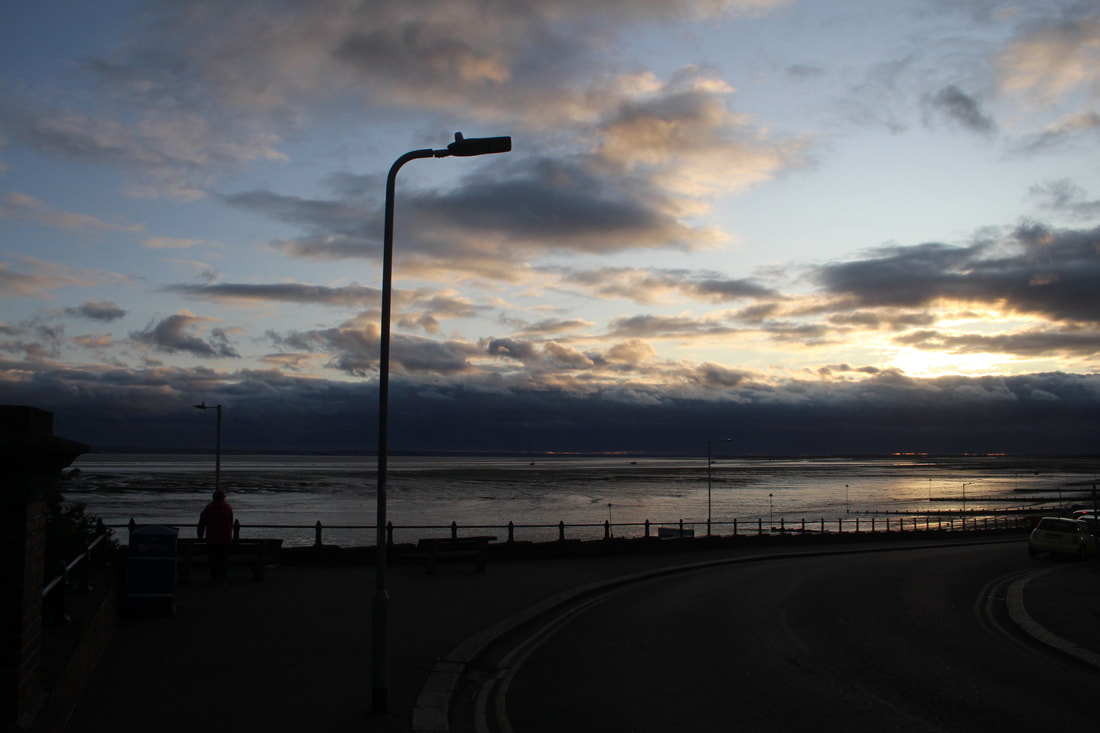
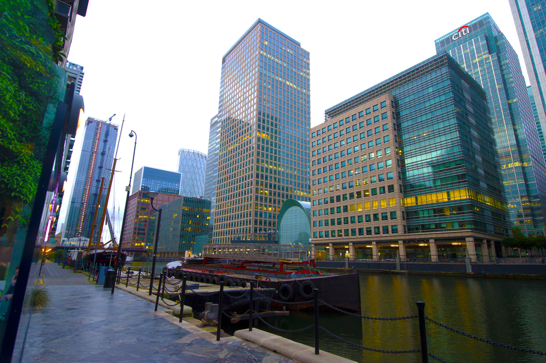
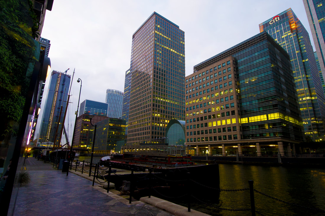
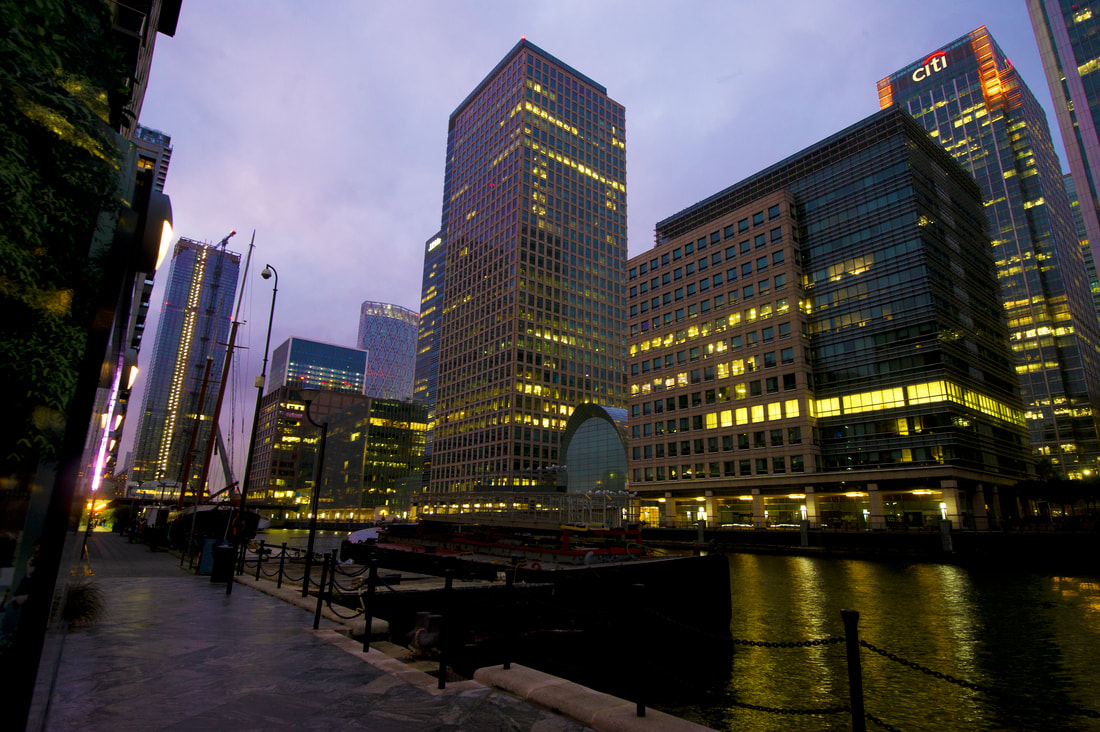
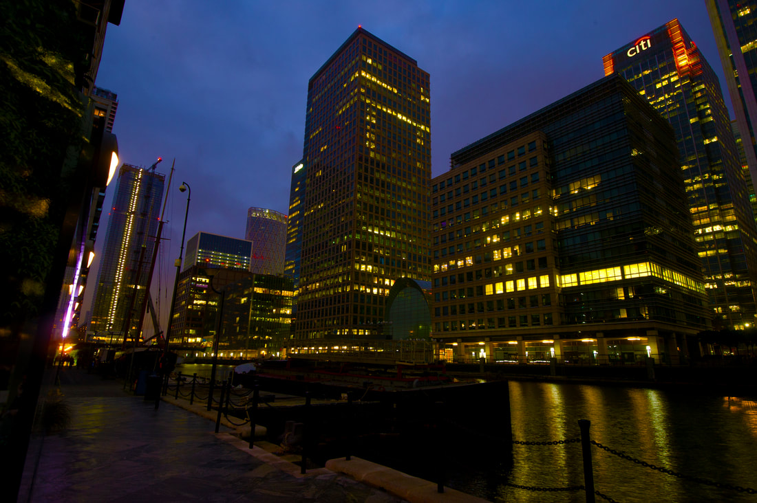
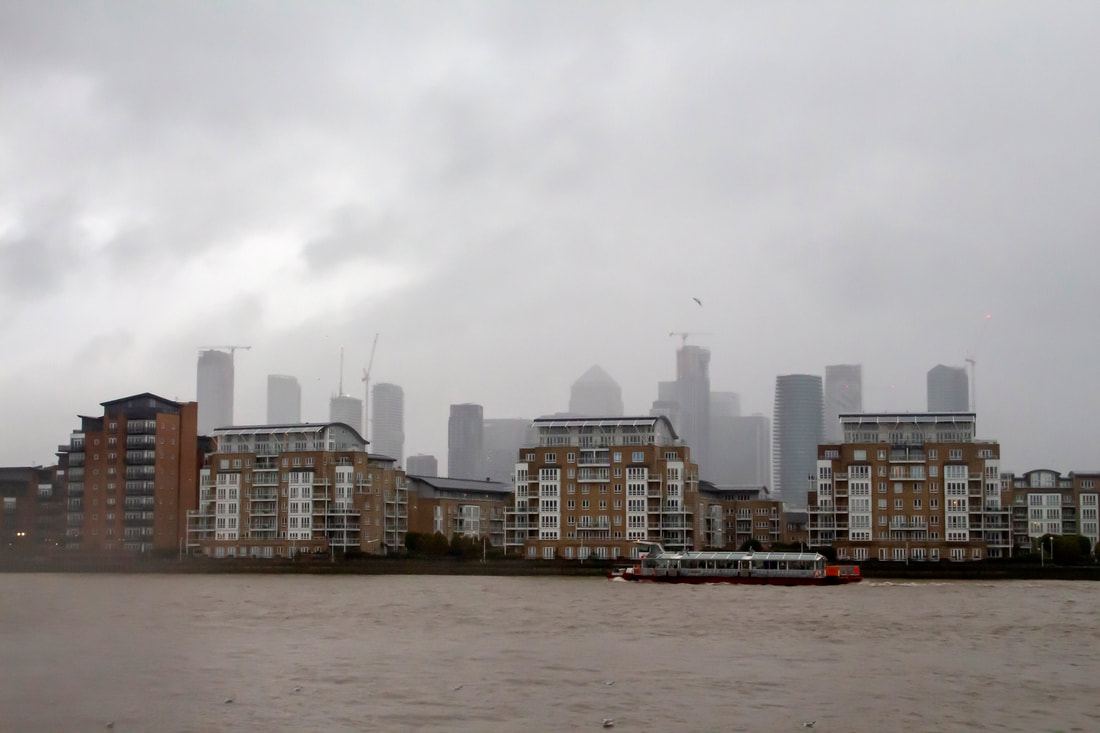
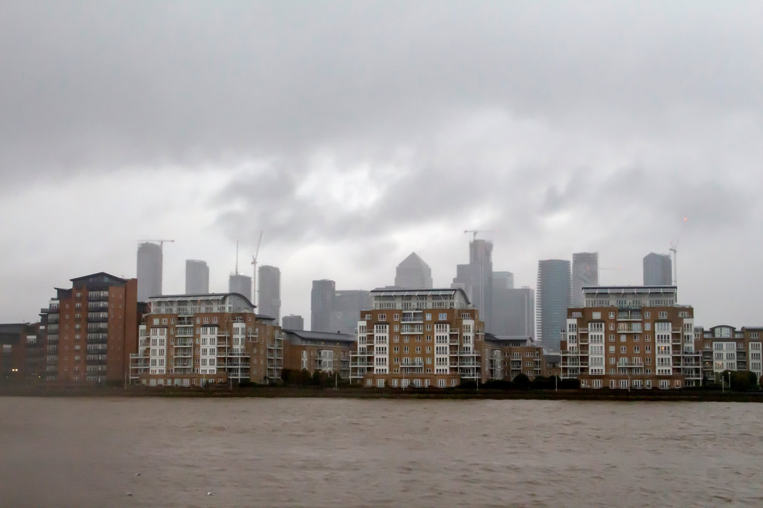
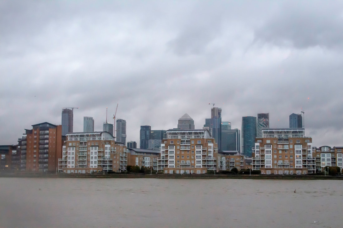
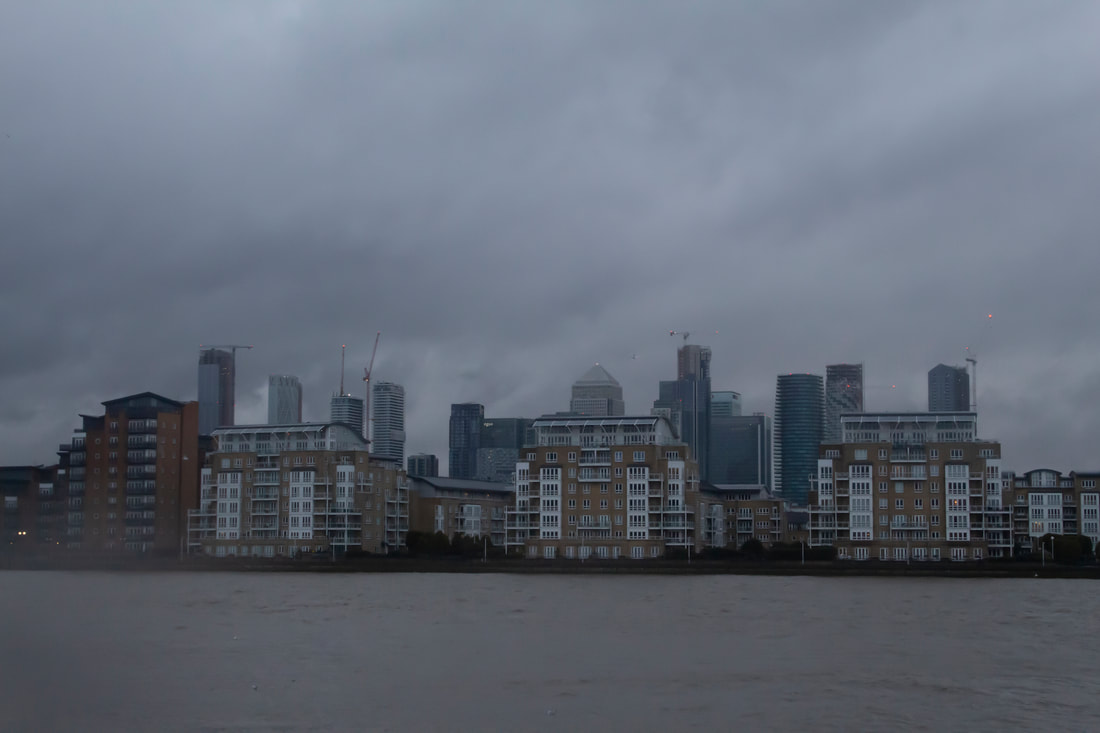
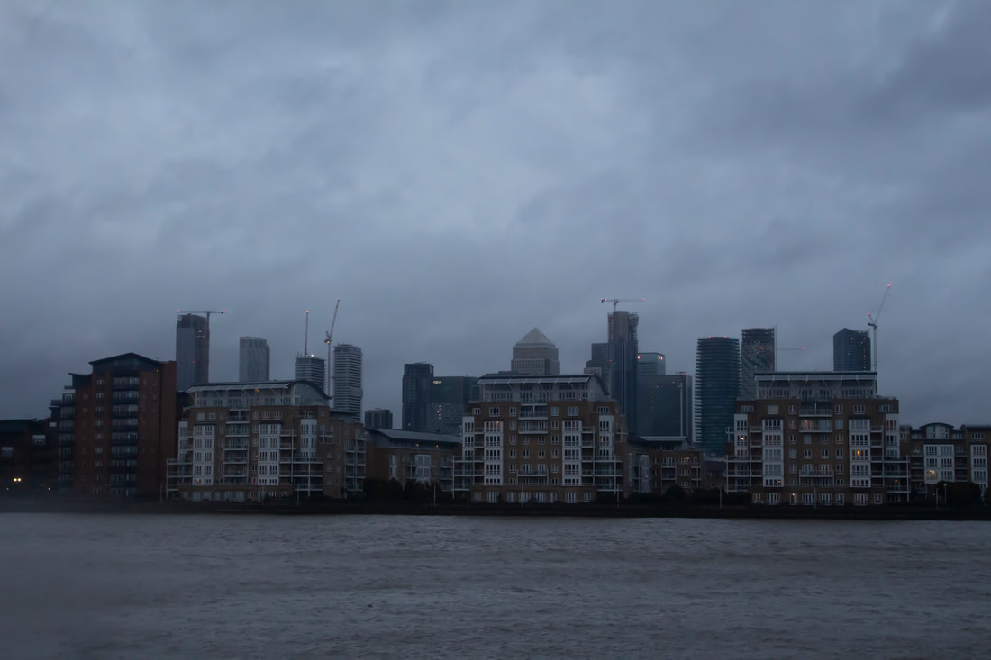
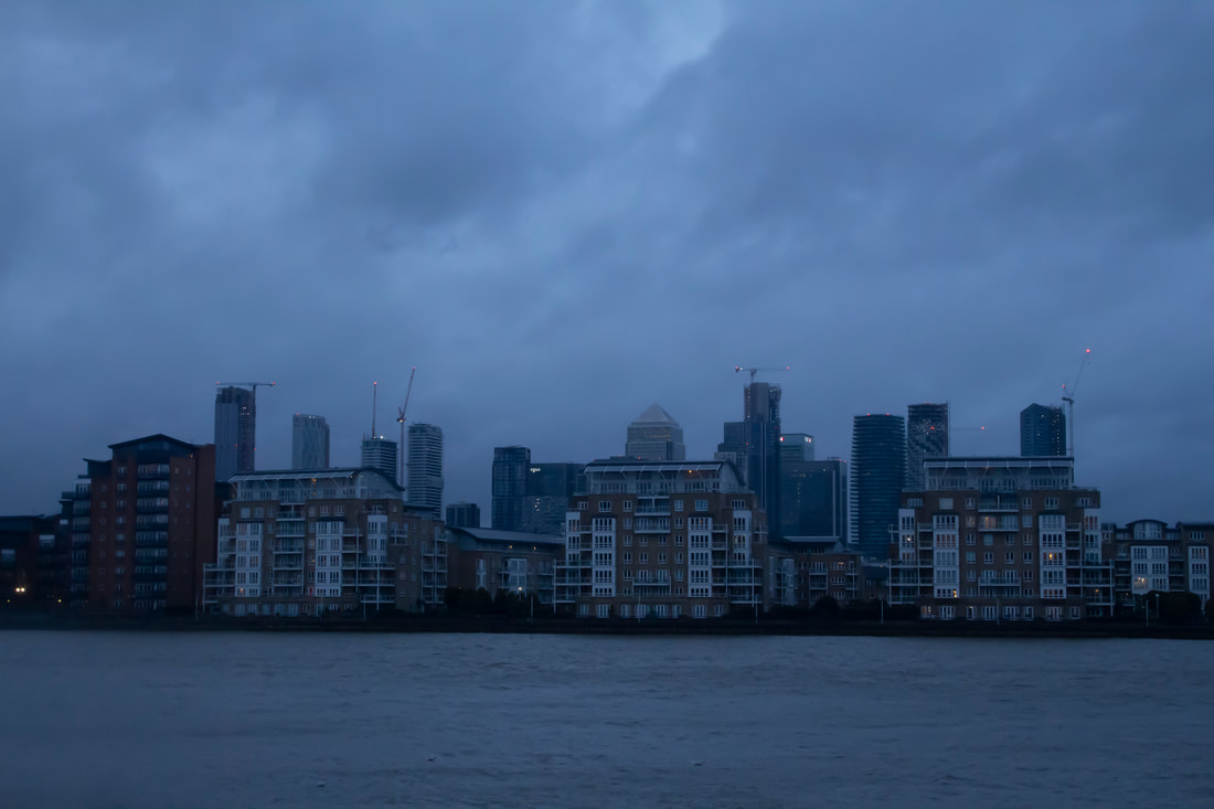
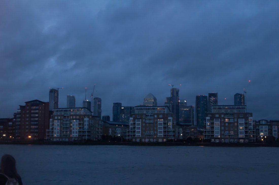
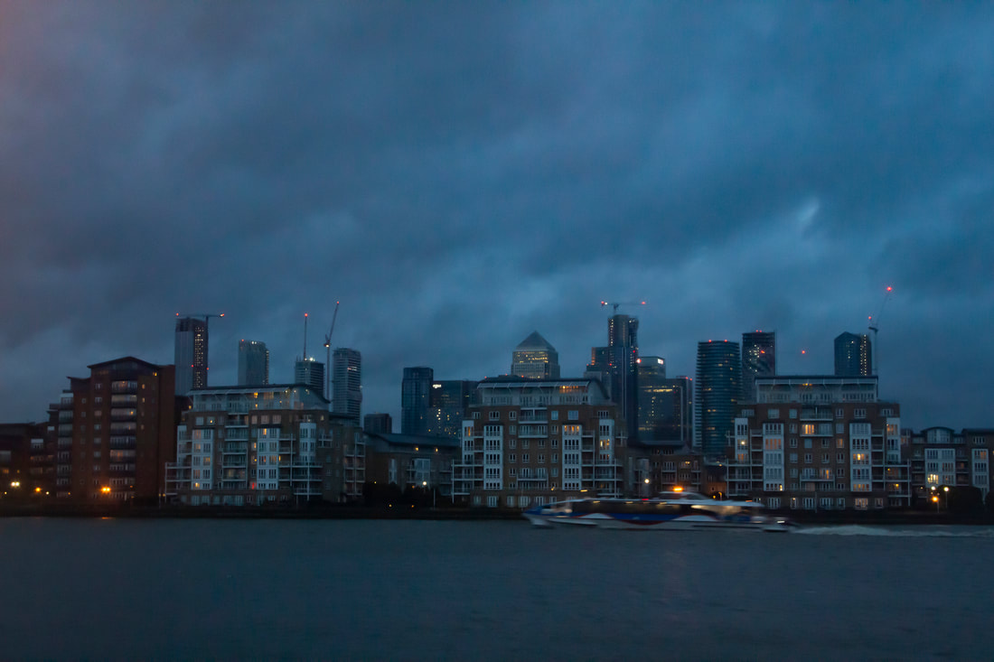
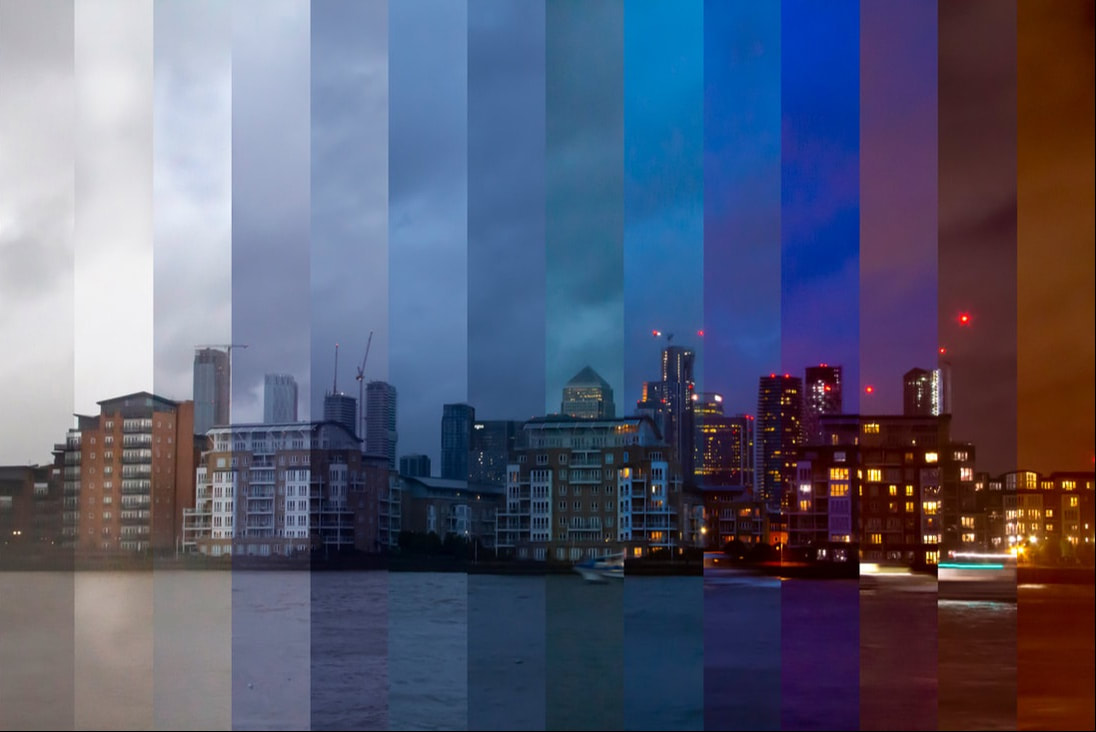
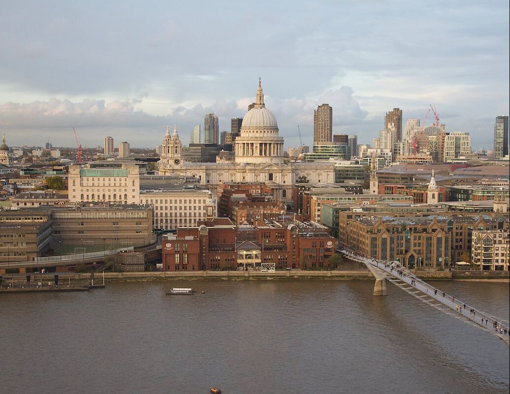
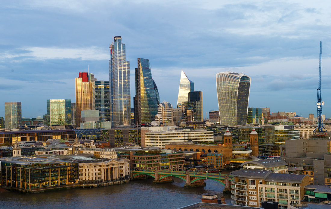
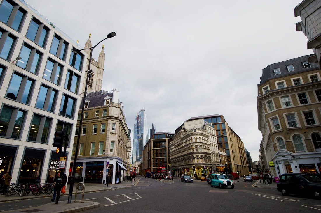
This shoot is designed as a starter for my development of night photography. I will begin by comparing identical pictures during the day and night and the effect each environment brings to the image. These are taken in my local area (Muswell Hill) but I am planning on exploring various sites in Central London and beyond.
|
|
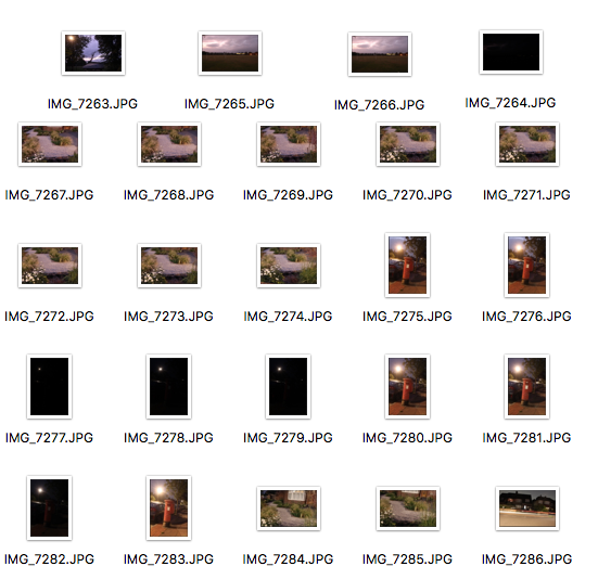
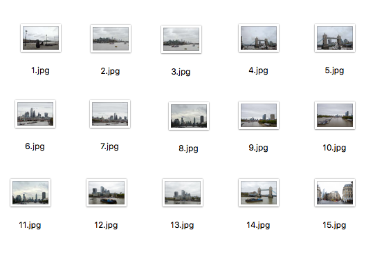
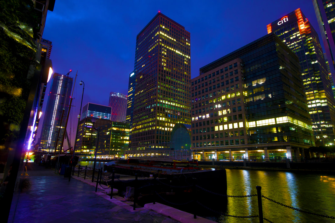
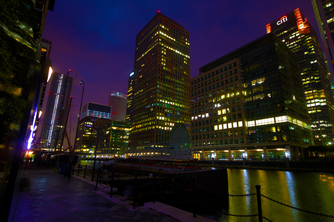
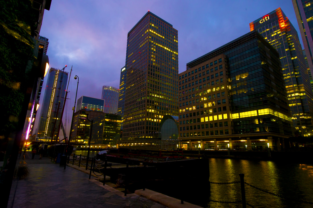
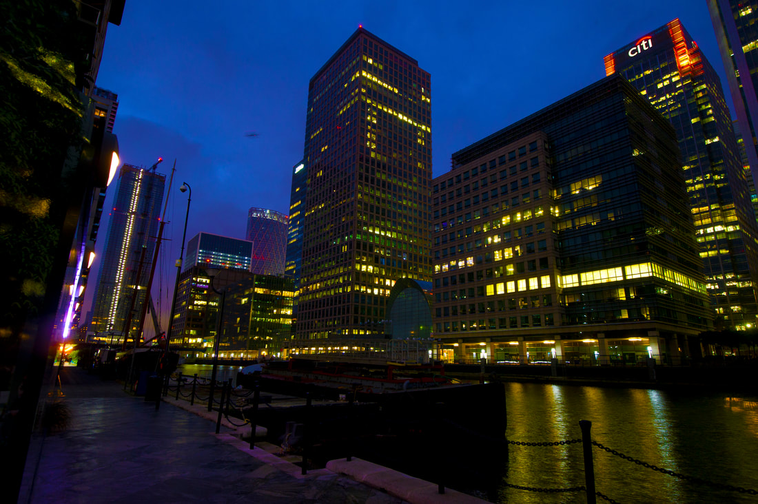
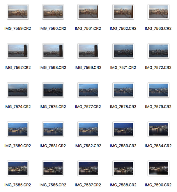
Day Contact Sheet
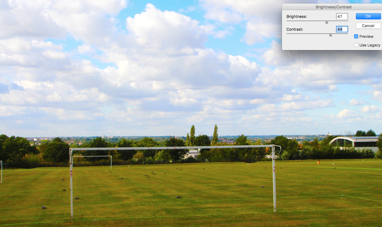
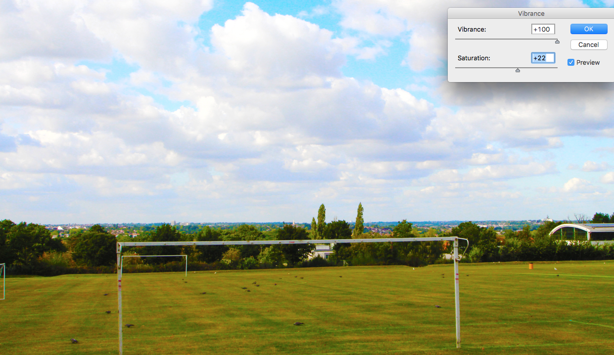
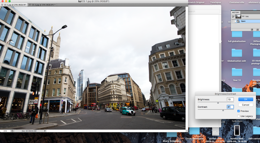
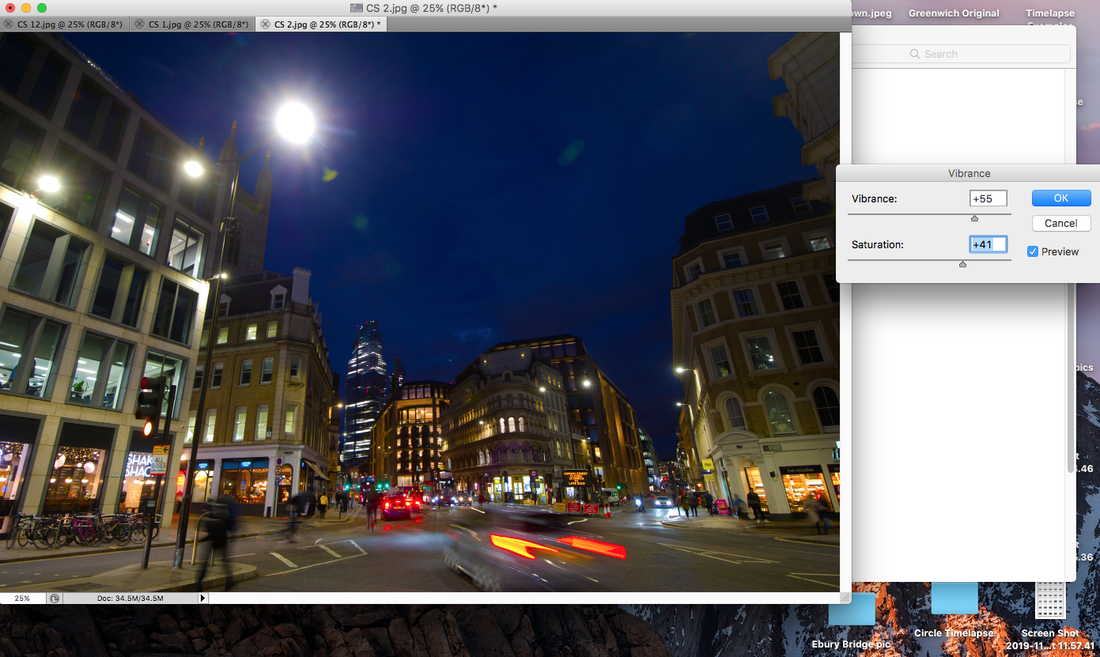
When editing all of my images, I adjusted the brightness and contrast until they complemented each other. Then I raised the hue and saturation as this makes the images more colourful and eye-catching to the viewer.
|
|
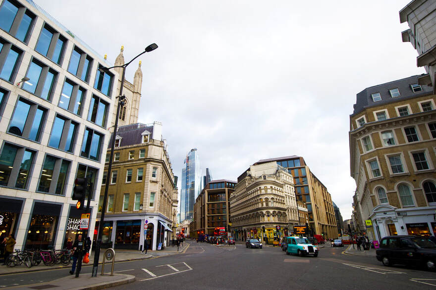
Day Enlargements
|
|
|
|
|
|
|
|
|
|
|
|
|
|
|
|
|
|
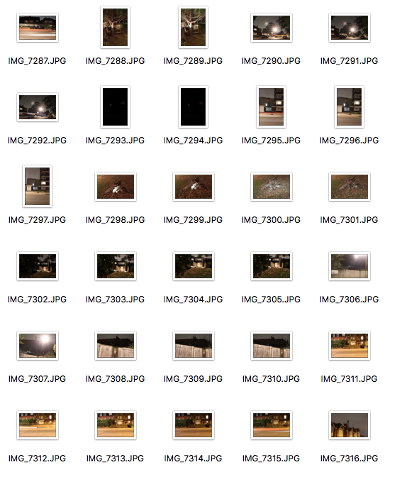
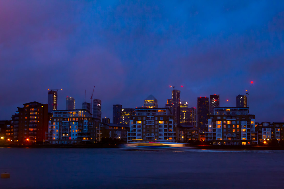
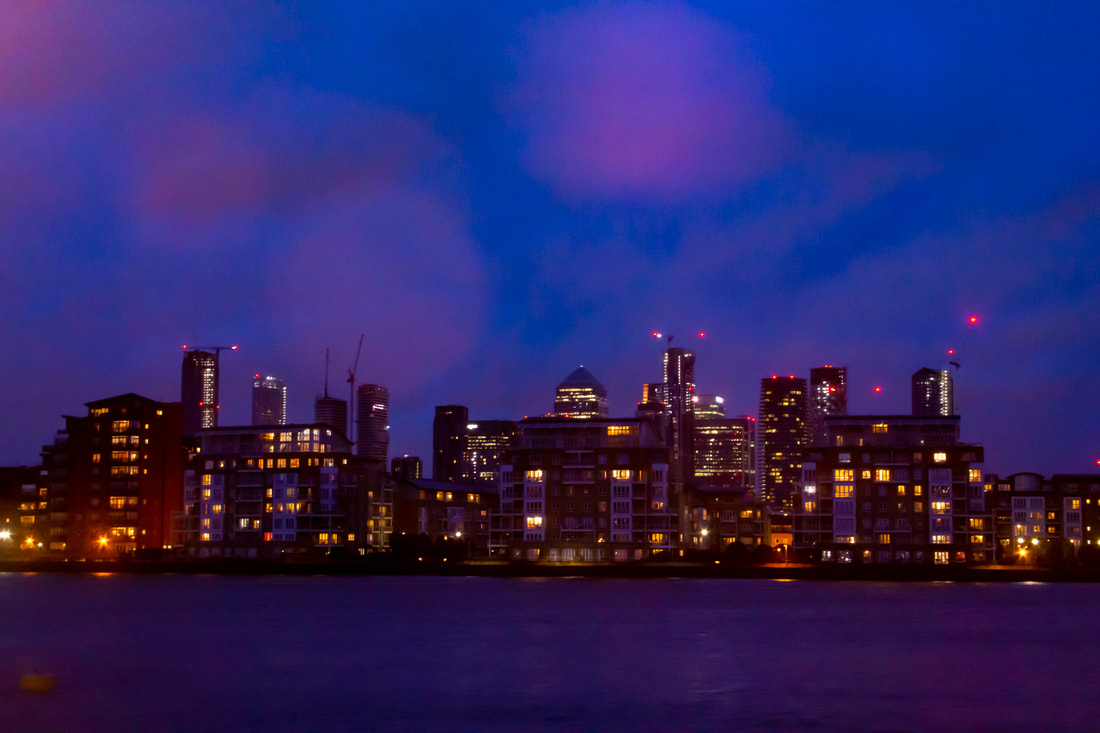
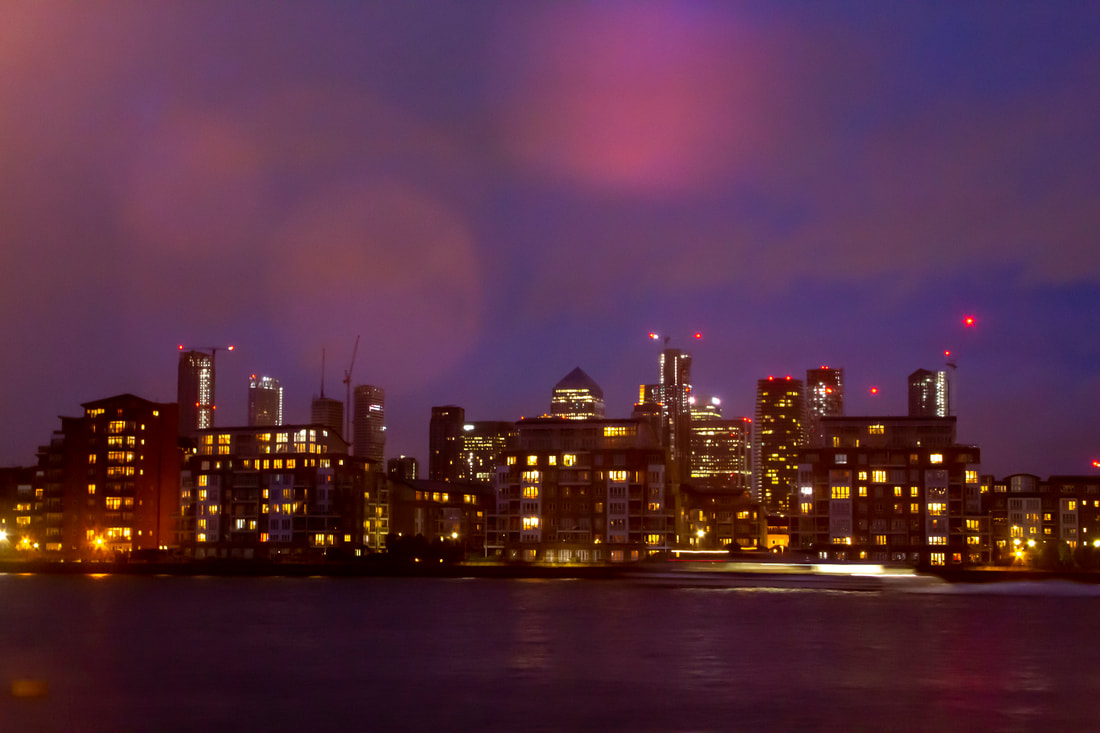
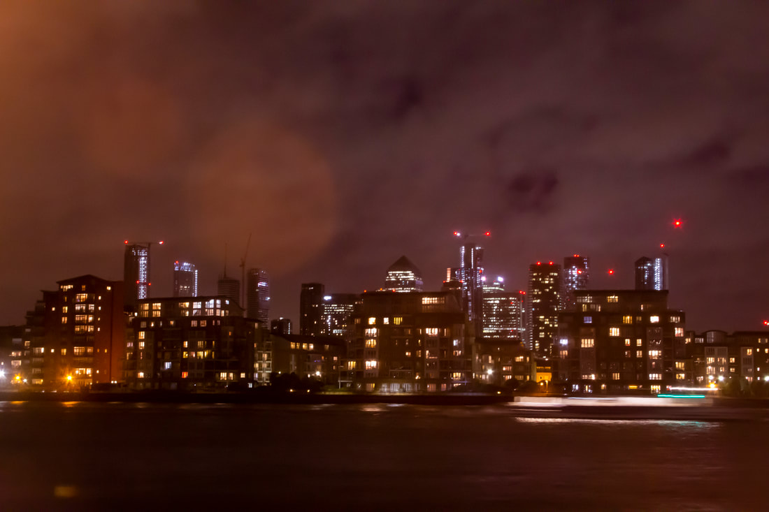
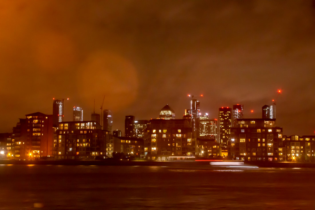
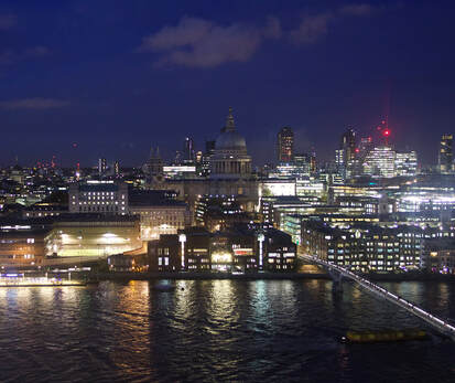
Night Contact Sheet
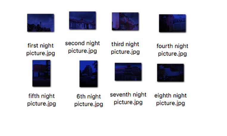
Actual Night Pictures
1st Response
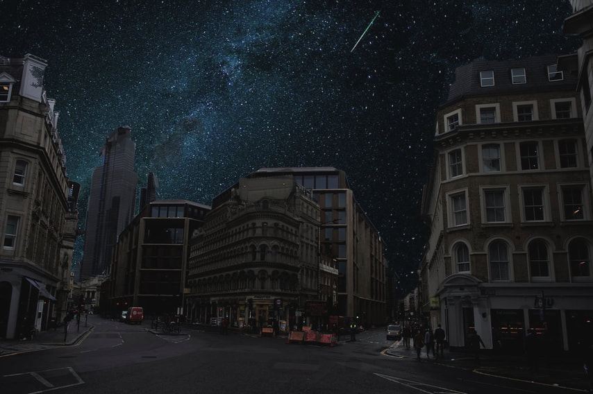
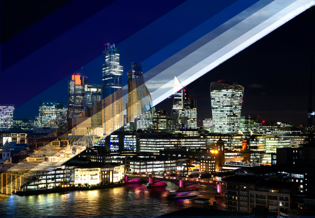
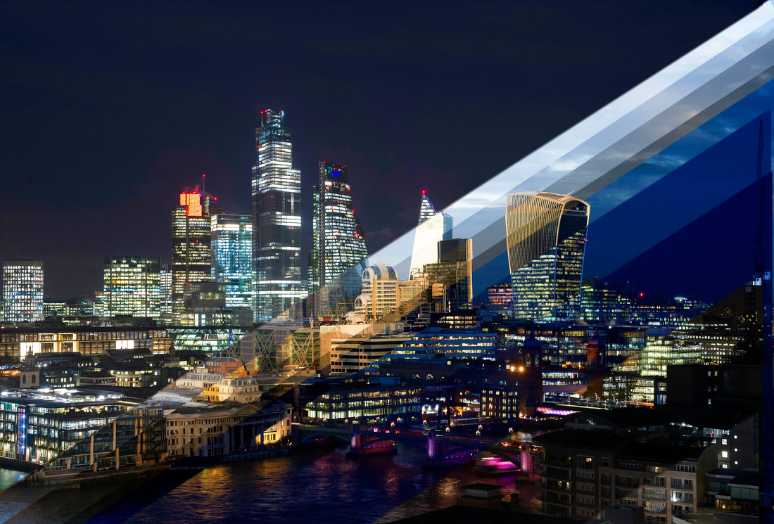
In order to develop my theme further, I have chosen to create a 'fictional night' by editing the day pictures to appear at night. I have chosen to edit the day pictures rather than the actual night images as I can manipulate the day images more into a colourful, dramatic final piece. I will also add fictional stars as well as fictional window lighting in order to enhance the image.
Fictional Night Contact Sheet
Fictional Night Final Pictures
Post production in Photoshop
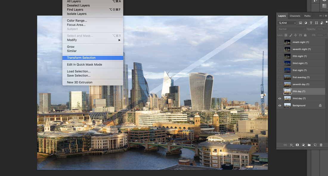
1. I ensured that all my images had been adjusted to a very low saturation such as -60%.
2. Next I added a new 'photo filter' layer where here I changed it to blue, had the density of it to 100% and made sure the 'Preserve Luminosity' was off.
3. Once the blue filter was set, I slightly reduced its opacity to 90% in order to make it more realistic.
4. I then selected a new 'gradient map' filter and ensured it was from white to black then turned on the 'reverse' button.
5. Once completed I changed the layers panel from 'normal' to 'multiply' so that the different layers would combine.
6. I used the gradient tool, ensuring it was on white to black, and drew lines down the image until I reached an effect I liked.
7. To add the stars, I went to the brush panel, chose a size of 21 px and had the spacing on and turned to 1000%. Then I turned on the scattering section and smoothing section, made the size jitter 100% and the scatter at 1000%. Then, I simply clicked on where I wanted to add a star to the sky.
8. To add yellow lighting to the windows, I chose the pen tool, zoomed in on the image, and drew lines attaching to one another on the windows I want selected. Then I right clicked and chose 'make selection'. I then went to the colours section in the bottom right corner and choose all yellow. Then I chose brush layer and ensured the mode was on 'overlay' and changed the opacity and flow to 30%. Then I held click and went over the windows until it reached a suitable effect. Then finally, I got to the selection tool and pressed enter.
Final Comparisons
2nd Response - Thierry Cohen
I first became aware of French photographer Thierry Cohen whilst studying for my curatorship task. He became inspirational since not only are his pictures visually original and stunning, they also have an environmental and political message. As public consciousness has become increasingly concerned about the way humans have detrimentally affected the planet, I thought he would be an appropriate artist to explore.
For the last decade Cohen has been documenting densely populated urban environments all over the world in an attempt to show how light pollution has increased over the last 50 years. He believes that the invasive aspect of too much light at night-time has affected not only our circadian rhythm (sleep/wake cycle) but is having a detrimental affect on all living organisms. Plant growth, migratory birds and animals dependent on moon cycles, such as egg laying turtles, are changing their natural instincts because of the influences of strong artificial light. He cites examples of people in areas where powerful lighting is present having a greater risk of suffering from breast and prostate cancers. All the aspects of wellbeing and maintaining a healthy lifestyle can be affected by light pollution according to Cohen.
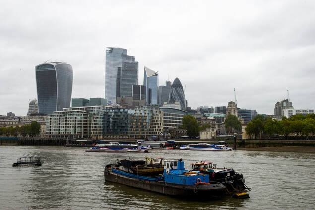
However, it’s not just the human inhabited areas that are affected. As a result of the earth's atmosphere, light can be diffused over large areas where once it was just darkness. The picture taken below by astronaut Thomas Pesquet in 2017 whilst orbiting the earth confirmed what Thierry Cohen was trying to show. Whole swathes of Europe are covered in artificial light at night, whilst to the edge of the picture a natural Aurora Borealis is on display until it meets the light pollution.
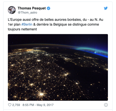
Belgium is singled out as the worst offender in Europe. The country keeps all of its 2.2 million street lights on throughout the night. Although they claim this is for safety reasons, others dispute the need for such volumes of light to be on at all times and point to the power stations that are state owned and making huge profits because of their constant usage. Cohen estimates that it would take half a ton of coal to constantly run a single 100w lightbulb for a year. When he combines that with the number of lights used in street lighting, the environmental costs become enormous.
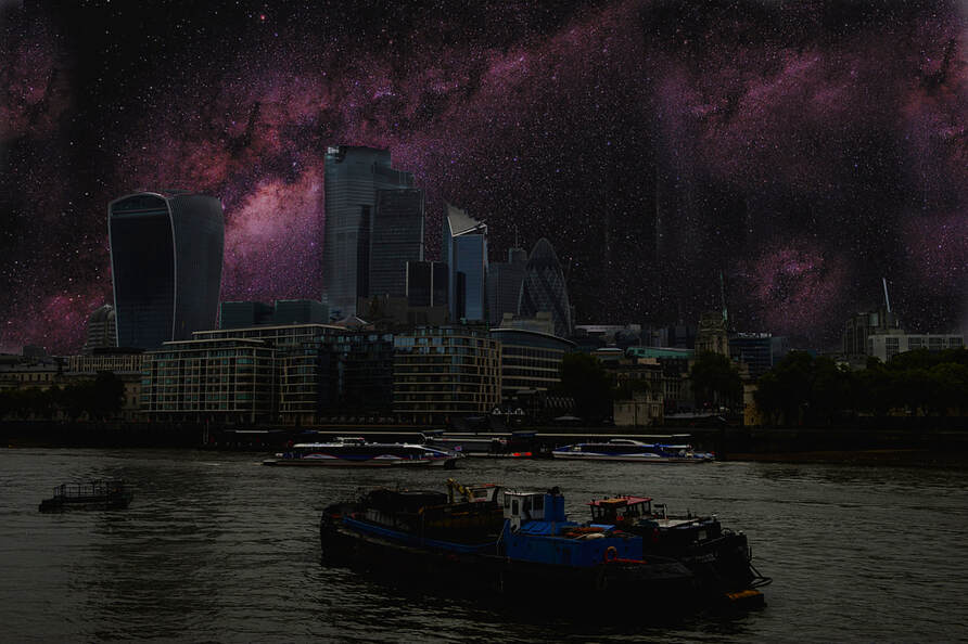
Thierry Cohen's unique approach involves travelling to areas free of light pollution that are situated on the same latitude as cities whose buildings emit ever increasing levels of artificial light. Travelling all over the world to achieve this, he has shot images in the Atacama Desert in Chile, the Mojave Desert in California and the northern wastes of Mongolia; places that have no buildings for hundreds of miles.
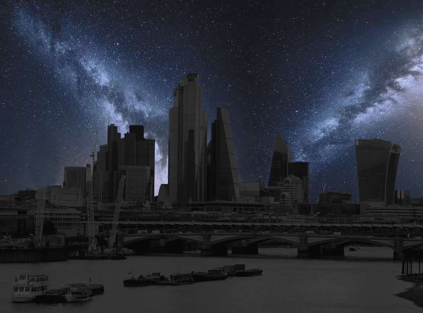
Combining these cityscapes on the same latitude or longitude of London, Chicago, Tokyo and Rio De Janeiro, Cohen demonstrates what major cities would look like without the influence of light pollution and smog created by air pollution. Therefore, this project will consist of trying to emulate the ideas of Thierry Cohen by capturing dramatic images combining cityscapes during the day, when offices and homes don't have to rely on artificial light, with superimposing striking star formations in the night sky. I plan to adjust the style of his images, which are very monochrome, by adding more colour into my images in order to make them more aesthetically pleasing. Hopefully, the clarity of the night sky produces dramatic effects when superimposed with city structures.
Thierry Cohen's unique approach involves travelling to areas free of light pollution that are situated on the same latitude as cities whose buildings emit ever increasing levels of artificial light. Travelling all over the world to achieve this, he has shot images in the Atacama Desert in Chile, the Mojave Desert in California and the northern wastes of Mongolia; places that have no buildings for hundreds of miles.
Combining these cityscapes on the same latitude or longitude of London, Chicago, Tokyo and Rio De Janeiro, Cohen demonstrates what major cities would look like without the influence of light pollution and smog created by air pollution. Therefore, this project will consist of trying to emulate the ideas of Thierry Cohen by capturing dramatic images combining cityscapes during the day, when offices and homes don't have to rely on artificial light, with superimposing striking star formations in the night sky. I plan to adjust the style of his images, which are very monochrome, by adding more colour into my images in order to make them more aesthetically pleasing. Hopefully, the clarity of the night sky produces dramatic effects when superimposed with city structures.
|
Two million people in London live in areas with toxic air, including 400,000 children. The fact that air pollution can cause respiratory problems has prompted the city's Mayor, Sadiq Khan, to move the cleanest buses to the most polluted routes as well as introduce a taxation on those highly polluting vehicles that enter the city centre. This hopefully will act as an incentive for people to use more environmentally friendly vehicles such as hybrid cars, reducing the levels of CO2 emissions. This will greatly benefit the city as air pollution causes at least 40,000 deaths in the UK from lung and heart disease, and is being linked to an increasing range of health impacts, from miscarriage to teenage psychosis.
Source: Guardian |
|
https://www.nytimes.com/2017/12/12/world/europe/belgium-electricity.html https://bigthink.com/strange-maps/london-air-quality-pollution-health?rebelltitem=1#rebelltitem1
https://www.ft.com/content/9c2b9d92-a45b-11e8-8ecf-a7ae1beff35b
https://www.independent.co.uk/news/health/london-air-pollution-smoking-cigarettes-heart-lung-disease-health-a9233676.html
Thierry Cohen's Images
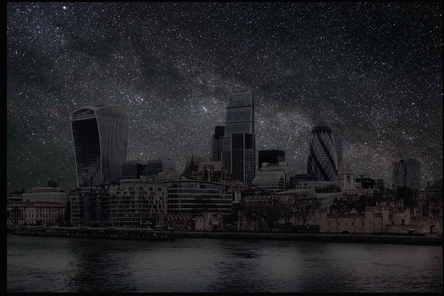
London from Southside Tower Bridge (10:39)
|
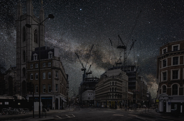
Cannon Street (14:08)
|
The two photographs above, captured in London, are my favourite Thierry Cohen images since they show areas I am very familiar with but as I have never seen before. They are incredibly dark, bleak and have an otherworldliness to them. You really need to look closely at them to recognise the sights and streets I have walked down. The street scene is rather apocalyptic and disconcerting with the complete absence of human life and its influences, showing how raw and hollow a city is without its cars and people. It is reminiscent of a skeleton without the components that complete the person. Very rarely do we get to see many of the formations and constellations of stars in the night sky in London due to the generated light pollution from buildings, street lamps as well as air pollution from cars and factories. It would be startling to see The Milky Way as Thierry Cohen has illustrated here.
|
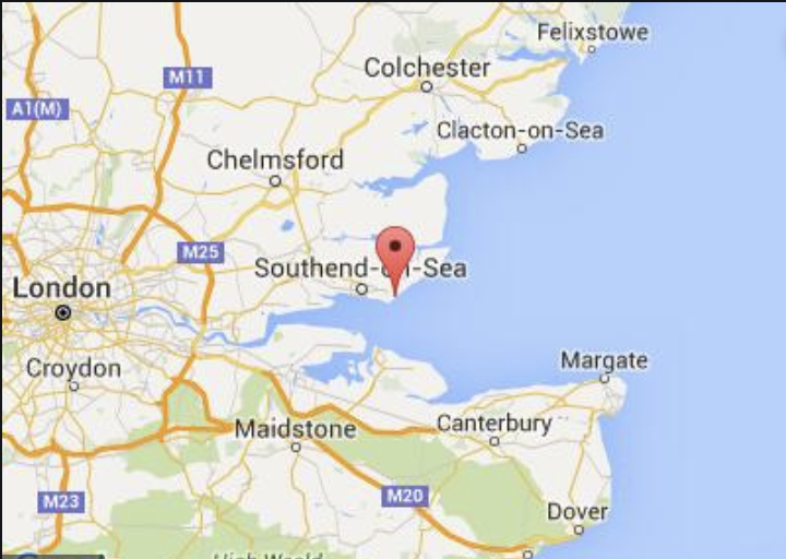
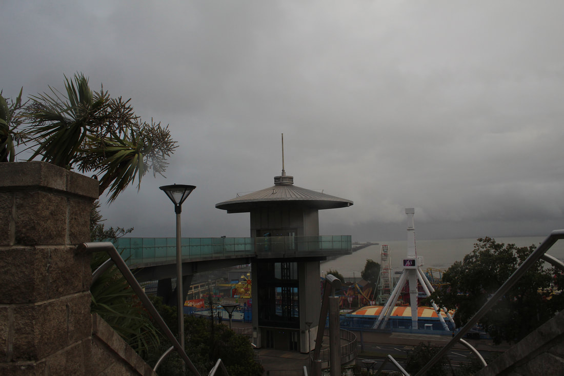
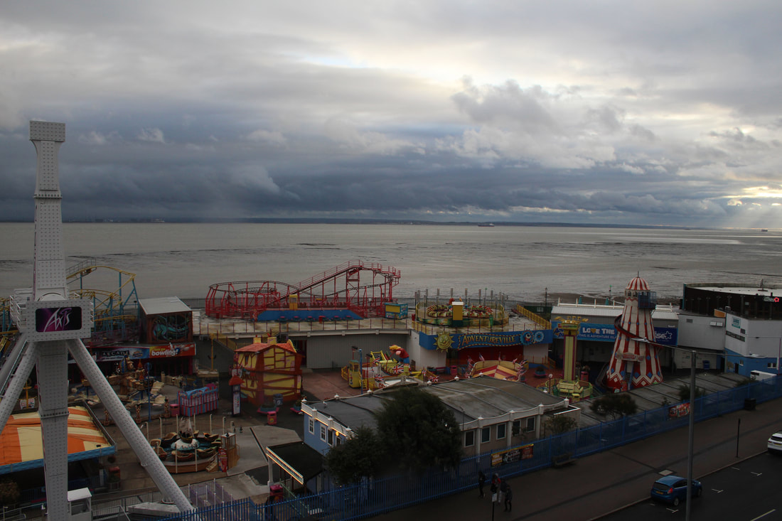
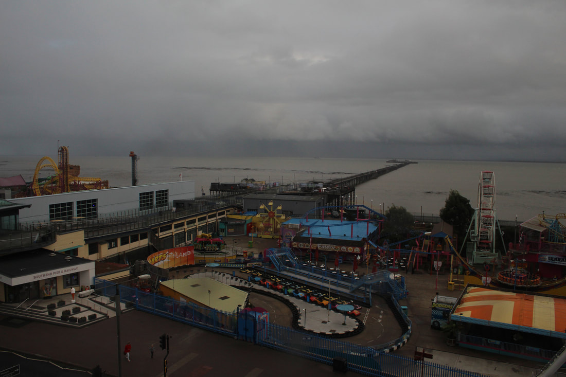
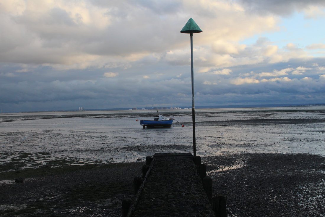
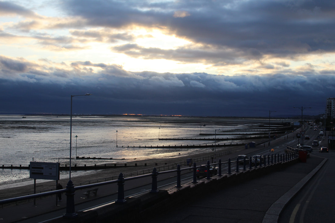
Southend
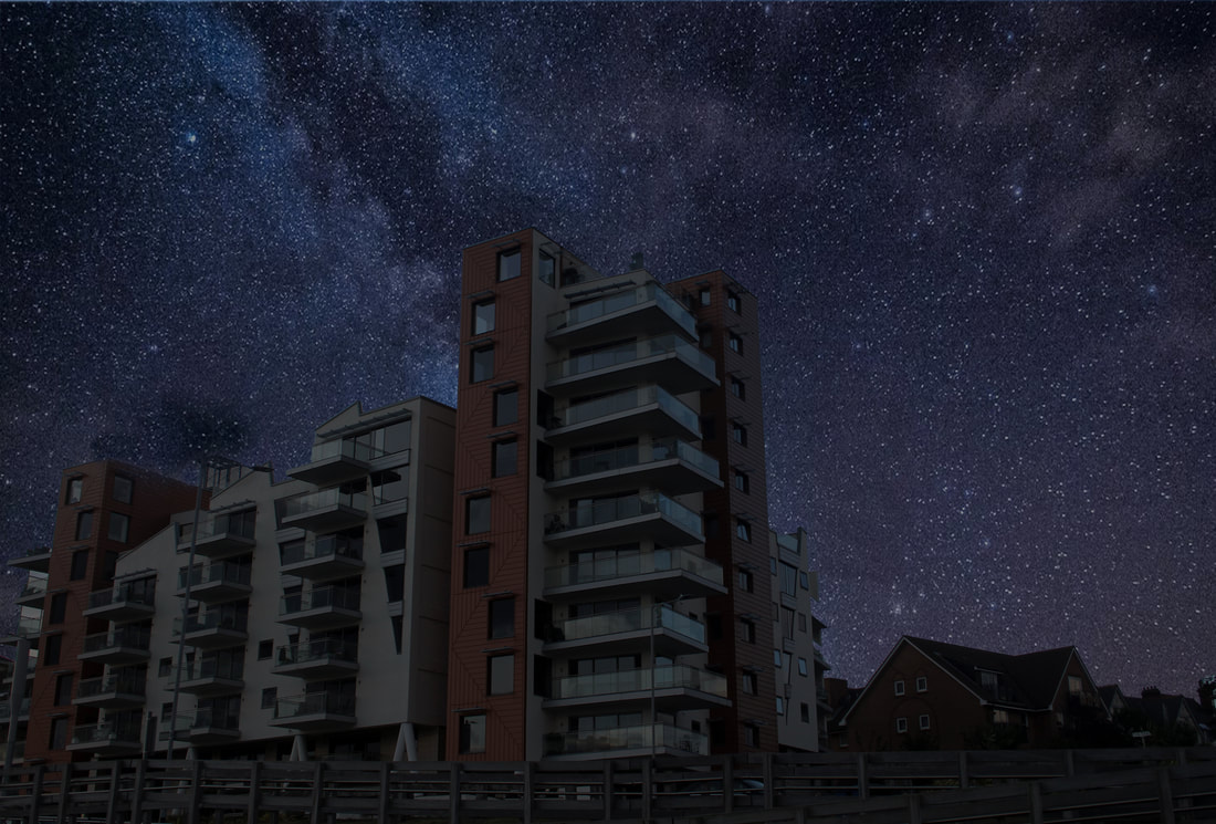
On a visit to Southend-on-Sea, Essex, I began to first experiment with photographing buildings and structures that may be developed in the style of Thierry Cohen. It was a nice contrast to shooting in an urban environment like my other planned projects. There was not actually a lot of light pollution down by the sea wall, the night sky became very dark and made me think of what Thierry Cohen was trying to illustrate. Shooting the coastline, Adventure Island Theme Park and local tall buildings, I had a wide variety of images to process and manipulate in Adobe Photoshop. |
|
Edited Enlargements
|
|
|
|
|
|
My First Attempt
Evaluation:
This first attempt inspired by the artist was relatively successful as it includes the juxtaposition between an urban building and a dreamy starry sky. The increase in the built environment means that people are less likely to see the clear nights without the influence of human habitation. By desaturating the image, my aim was to portray the building as enveloped by the night sky. Enhancing the hue of the night sky to contrast with the light-less building, I am pleased with the initial attempt and result. I was glad nobody had a light on in any of the rooms in the block of flats even though it was late in the day as that would have ruined my attempt.
This first attempt inspired by the artist was relatively successful as it includes the juxtaposition between an urban building and a dreamy starry sky. The increase in the built environment means that people are less likely to see the clear nights without the influence of human habitation. By desaturating the image, my aim was to portray the building as enveloped by the night sky. Enhancing the hue of the night sky to contrast with the light-less building, I am pleased with the initial attempt and result. I was glad nobody had a light on in any of the rooms in the block of flats even though it was late in the day as that would have ruined my attempt.
Central London Contact Sheet
My Second Attempt
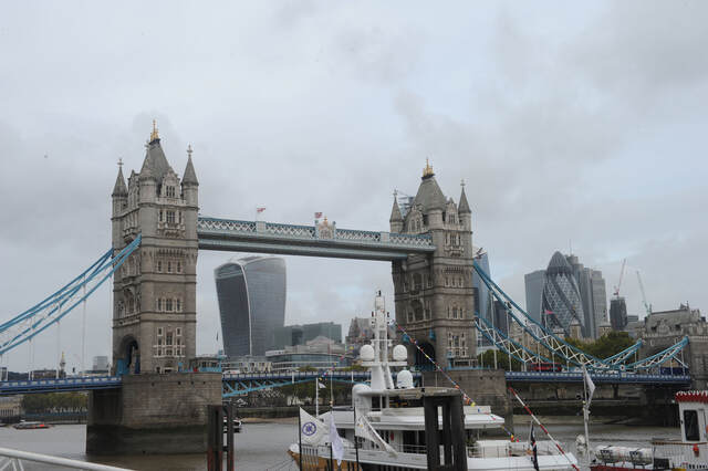
Tower Bridge Original Image
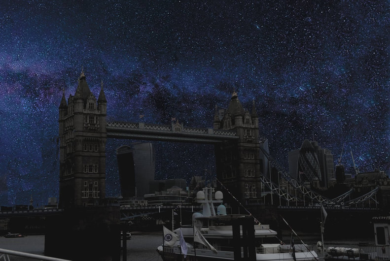
My version of Tower Bridge inspired by Thierry Cohen
Cannon Street Original Image
My version of Cannon St Junction from same location as Thierry Cohen
City of London Original Image
City of London Final Edit from same location as Thierry Cohen
Blackfriars Bridge and City of London Original Image
Blackfriars Bridge and City of London Final Edit Inspired by Thierry Cohen
Wapping Wharf from the Design Museum Original Image
Wapping Wharf from the Design Museum Final Edit Inspired by Thierry Cohen
Post production in Photoshop
- To merge the two pictures, I placed both the cityscape and starry night sky image into the Layers function in Adobe Photoshop. This meant I could work on them independently before combining them.
- With my original cityscape image, I used the 'Magic Wand Tool' and highlighted the sky. Here I carefully drew around the buildings and selected the area to be blended.
- Next step was to 'Select' and use the 'Inverse' function. This resulted in the sky now being selected to be worked upon.
- Once completed I held 'Command + J' to make the outline of just the cityscape without the sky.
- Next I went to the image of the stars, held 'Command + A' to select all of the image and then 'Command + C' to copy it.
- Going back to the city image, ensuring I was on 'background' Layer - a crucial step otherwise if on Layer 1 would mean the sky and stars would be pasted on the front of the buildings not in the correct position. Once completed I held 'Command + V' to paste the image of the stars on to the cityscape image.
- To finalise, I went to 'Edit', 'Free Transform' and expanded the image of the stars to fit the empty sky. Importantly I discovered that the larger the image size, the more realistic the final image looks.
Conclusion of 2nd Development
Overall, I believe that my first idea of development was successful in achieving my goal of experimenting with different versions of a theme based on Thierry Cohen.
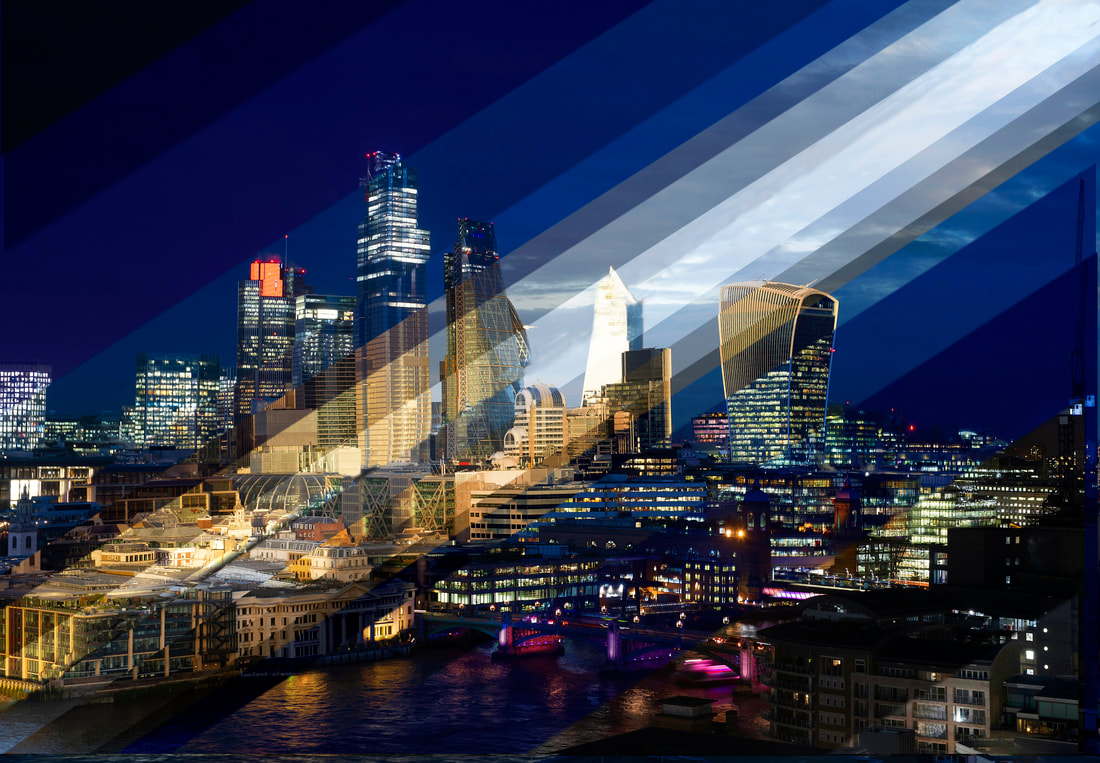
This part of the project enabled me to recognise which type of buildings merge more effectively with a mesmerising night sky, with the key components being bold and recognisable along with having shape and form. As a result, my most impressive images included the iconic landmarks of London such as Tower Bridge, 20 Fenchurch Street (Walkie Talkie Building) and the Leadenhall Building (Cheesegrater). It also enabled me to see the effect of the impact that the level of ambient light and direction of the sun plays in the overall look of the image. For example, my image of Blackfriars Bridge with the City of London behind was taken very early in the morning with the sun rising from the east. Consequently, west facing aspects of buildings had little direct sunlight with shadows forming all around them caused by neighbouring buildings obscuring the sunlight.
To make a striking image I decided to experiment with a dramatic 'V' shaped sky that added depth and focus, drawing the viewer's eye into the picture. I think the image works as this juxtaposes with the sharp and angular shape of the modern buildings.
I was pleased I was able to pinpoint and replicate where Cohen had taken his pictures in Cannon Street and the backdrop of the City of London from Tower Bridge and photograph them myself. However this shoot made me realise how difficult it must have been for him to have taken an image where no humans or cars entered the image. My image taken from the same location as Thierry Cohen of the City of London at the Southbank has a large barge anchored in it. It was slightly frustrating I could not quite emulate his photograph with no boats at all visible. However, finding the same location allowed me to compare and experiment with my colourful night sky image and his monochromatic perception to discover which was more effective. Manipulating the images and adjusting the colour at night time enabled me to combine reality and fiction using the ideas and methods of a distinguished photographer. I felt his dark versions certainly were melancholy, they showed a sadness about how we had interfered with nature and may be forced to live with the consequences.
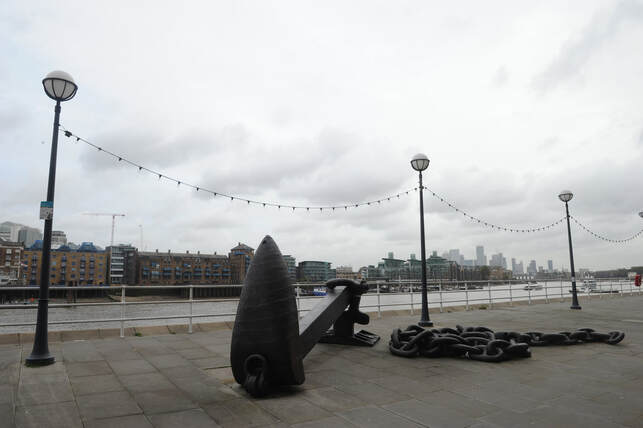
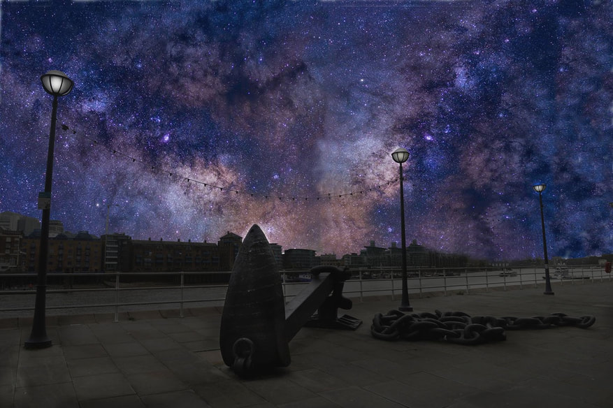
In my last image I decided to add even more colour to the sky to emphasise the effect of light pollution. I chose an area where no cars or boats could be seen and waited until there were no pedestrians, emphasising the bleakness of the location. The dark shadow of the ancient ship's anchor and lights on the cables elevated above, add to the effect. There is some light on the vintage street lamps to make the viewer aware how we have taken artificial light for granted in a by-gone era without knowing the detrimental effect it had on lots of living things.
This part of the project enabled me to recognise which type of buildings merge more effectively with a mesmerising night sky, with the key components being bold and recognisable along with having shape and form. As a result, my most impressive images included the iconic landmarks of London such as Tower Bridge, 20 Fenchurch Street (Walkie Talkie Building) and the Leadenhall Building (Cheesegrater). It also enabled me to see the effect of the impact that the level of ambient light and direction of the sun plays in the overall look of the image. For example, my image of Blackfriars Bridge with the City of London behind was taken very early in the morning with the sun rising from the east. Consequently, west facing aspects of buildings had little direct sunlight with shadows forming all around them caused by neighbouring buildings obscuring the sunlight.
To make a striking image I decided to experiment with a dramatic 'V' shaped sky that added depth and focus, drawing the viewer's eye into the picture. I think the image works as this juxtaposes with the sharp and angular shape of the modern buildings.
I was pleased I was able to pinpoint and replicate where Cohen had taken his pictures in Cannon Street and the backdrop of the City of London from Tower Bridge and photograph them myself. However this shoot made me realise how difficult it must have been for him to have taken an image where no humans or cars entered the image. My image taken from the same location as Thierry Cohen of the City of London at the Southbank has a large barge anchored in it. It was slightly frustrating I could not quite emulate his photograph with no boats at all visible. However, finding the same location allowed me to compare and experiment with my colourful night sky image and his monochromatic perception to discover which was more effective. Manipulating the images and adjusting the colour at night time enabled me to combine reality and fiction using the ideas and methods of a distinguished photographer. I felt his dark versions certainly were melancholy, they showed a sadness about how we had interfered with nature and may be forced to live with the consequences.
In my last image I decided to add even more colour to the sky to emphasise the effect of light pollution. I chose an area where no cars or boats could be seen and waited until there were no pedestrians, emphasising the bleakness of the location. The dark shadow of the ancient ship's anchor and lights on the cables elevated above, add to the effect. There is some light on the vintage street lamps to make the viewer aware how we have taken artificial light for granted in a by-gone era without knowing the detrimental effect it had on lots of living things.
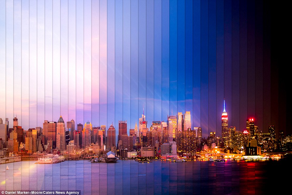
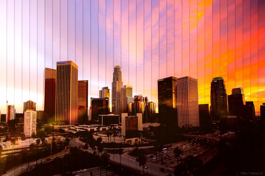
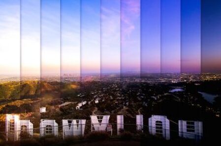
3rd Response - Dan Marker Moore
In order to further develop this theme of night photography, I will be using the techniques of US photographer Dan Marker Moore as he compares the cityscape transitioning between day to night in an abstract way. A self taught photographer with a background in directing commercials and animation design, he started to take photographs for his Instagram feed. For his projects he spends long periods of time, sometimes up to 18 hours at certain locations all over the world. Depending on the desired effect he points his camera in one position and captures the unfolding scene by shooting pictures at regular timed intervals; sometimes over a thousand images to create a scene using around 50 slices. He edits the slices so they get darker and darker as the slices move across the photograph as daylight turns to darkness.
He says, "A Time Slice is an image built from the photos of a time-lapse. Each slice is a photograph taken at a different point in time, usually a few minutes after the previous slice. All the Time Slice images are unique, made from a different number of images, over a different amount of time. My process involves a great deal of exploration and experimentation by mixing time in various ways. When I can I visit a location numerous times until my vision is captured."
"I just love skylines. I take a lot of time-lapses and it's a real treat to watch the sunset fade as the city lights begin illuminating the sky. This is what I try to capture".
Taking inspiration from Dan Marker Moore, I plan on staying in an area for several hours taking a picture of the same scene every 5 minutes or so in order to get a gradual transition of how the environment changes as the light alters. The best locations for this are ones having interesting shaped buildings that are illuminated as the light fades.
Technically this is challenging as the camera has to be in one fixed position. I have to use a tripod and a cable release because the slightest movement or change in camera position can ruin the transition as the buildings will not be in the exact same position and I will not be able to line up the multiple images in post production. Therefore, to get the best effect, similar to Marker Moore, where everything is sharp and in focus from the foreground to the background, I will be using a high lens aperture of f22 accompanied with a very slow shutter speed - especially as the light dims. Shooting these scenes, the camera exposure has to be completely manually controlled. Using any of the automated features would produce an underexposed image. I have learned that to keep the image noise down to a minimum I have to use a relatively slow ISO (400 asa) and use the camera raw files rather than the compressed jpgs. This way the final image can be adjusted much easier.
|
|
|
|
Dan Marker Moore is an inspirational visual artist. I enjoy the way he uses his multiple time-lapse images to create his time-slice photographs. This technique is like a bridge or link between movie making and still photography. Instead of his camera recording at 30 or 60 frames per second and layering those images to create a video, he shoots the unfolding scene every couple of minutes and puts the slices side by side. When displayed, these impressive pictures are accompanied by a video showing the actual series of events happening. I think both forms of artwork compliment each other rather than forcing me to decide on my preference.
I think there is much to admire in the work of Dan Marker Moore, not just the ways the jigsaw pieces all fit together, but the colours he manages to capture over a period of time. Choosing to shoot the scenes at different times of the day and seasons he is able to target bright bold light and with the night time transition as buildings illuminate, use it to draw the viewer in.
Knowing which buildings will illuminate the best or most effectively throughout the slice is crucial. His photograph, above, of Manhattan shows this well with The Empire State Building in the night time zone with its iconic blue tower perfectly illuminated against the dark sky. It would have been a waste to position the camera showing it during the daytime.
Often he makes use of different light in different areas on the location he photographs. In the video above you can see the light changing not only on the city but also on the mountain behind. The juxtaposition of illuminated light being turned on in the city when daylight declines as the mountain range in the background are still bathed in sunshine because of their colossal size, still facing the fading sun create a huge range of colours. In this instance he chooses to add to the drama by slicing the picture in a triangle formation to emphasise the mountain top peaks. Thoughtful planning and no doubt a lot of patience create stunning images and accompanying videos. I would love to see them at a gallery since I think the bigger they are presented, the better and more impressive they would look.
|
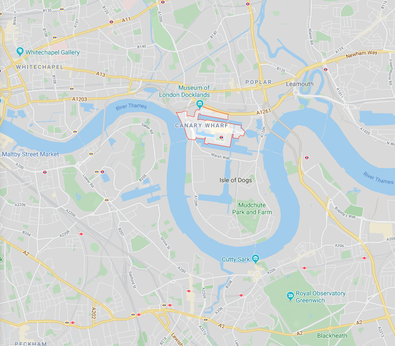
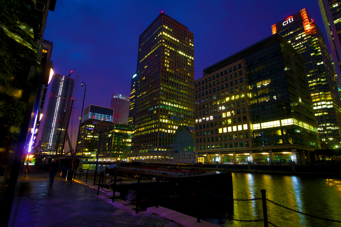
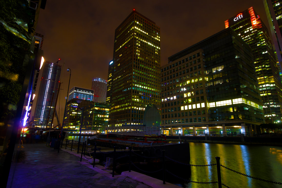
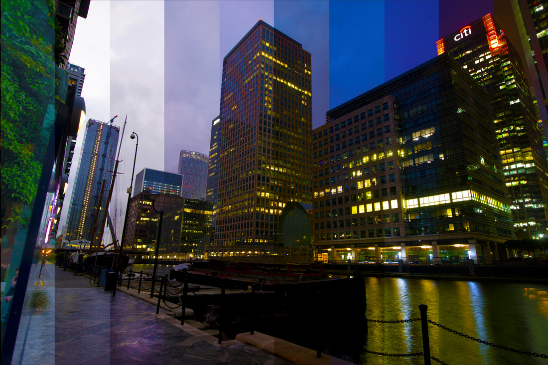
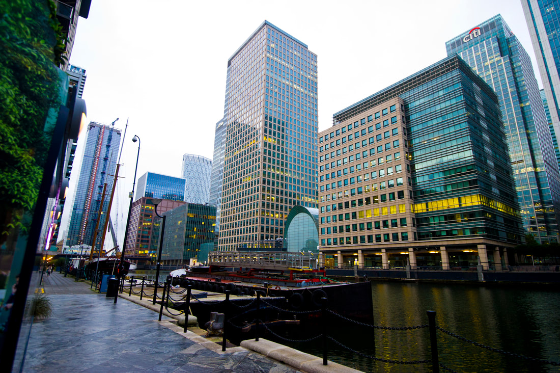
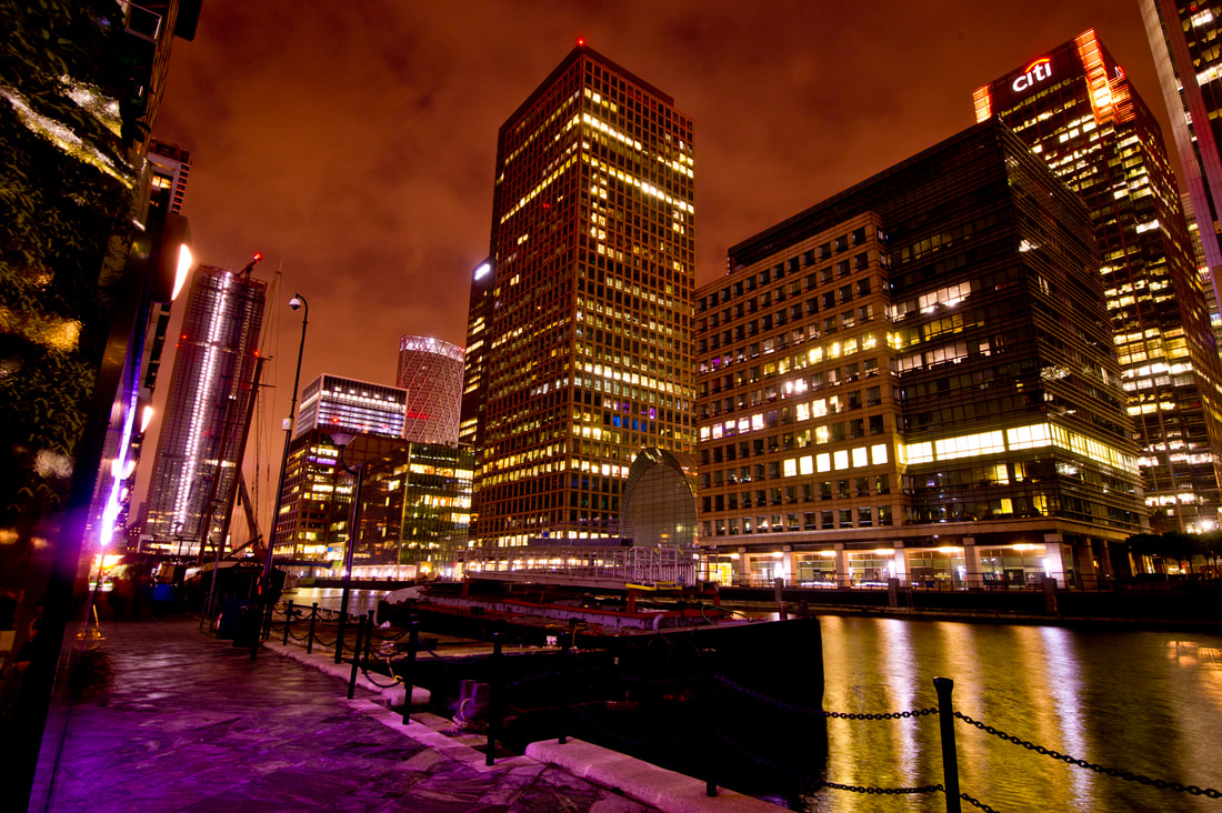
Canary Wharf
Canary Wharf is located on West India docks on the Isle of Dogs in East London. Together with the City of London, it is one of the main financial hubs of the UK and the world. It contains many tall buildings and is home to the second-tallest building in the UK, One Canada Square. It hosts the annual 'Winter Lights' art installations showcasing some of the most innovative artists from across the globe. This ties in perfectly with my idea of time-slices where artificial illumination is vital.
Source: Wikipedia |
|
Canary Wharf Contact Sheet 1
I decided to return to Canary Wharf to try and improve my earlier shoot. Although my previous images look pleasing, they could be enhanced by using a wider angled lens to capture more buildings and, most importantly, more sky so that the transition is more visible and dramatic.
Canary Wharf Contact Sheet 2
Location: Canary Wharf
Time Spent: 2 hours and 30 minutes
Images Taken: 54 and 43 images
Time Spent: 2 hours and 30 minutes
Images Taken: 54 and 43 images
Edited Enlargements
|
|
|
|
Number of slices: 10
Evaluation
This development is a first good attempt as there is a visible change in colours from the left to the right side of the image. However, doing this time-slice from South Key of Canary Wharf has allowed me to consider how I can make future images more effective. Firstly, I had to shoot from a low vantage point using 16-35mm lens to get all the buildings in the picture. This has distorted the angle of the image, particularly the edges of the frame, as vertical buildings seem to converge. It is generally better to avoid such wide lenses with buildings if you have option. Furthermore, as I went during the weekend, the fact that the buildings were largely empty of workers meant there were fewer windows illuminated, as everyone was enjoying a day off. More lighting would have made the image more exciting. Companies are becoming more aware of the cost and the environmental damage of supplying a building with power when nobody is there so they tend not to have the lights on.
I believe that including even more of the sky in future shoots will allow the viewer to distinguish each 'slice' better as this image shows very little transformation towards the end of it as the light fades. Marker Moore uses lots of slices in his finished image so I plan to add more, next time. It is deceptive how light changes so much as the day darkens. At first, when I took the pictures, it looks relatively bright but just small adjustments of the camera aperture/shutter speed can quickly alter that look. It is with trial and error that I can create a visually pleasing image. The more experience I have, the more I am beginning to realise which settings are most effective. If I return I want to try and get a higher vantage point and I will visit the site earlier so I can capture the scene more at day as my first time-slice is more focused on the late evening/night time. Sometimes this can be the most effective part of the image if clouds are present.
|
Greenwich Peninsula
Greenwich is a famous borough in South-East London notable for its maritime history. It is also the birthplace of the great English King Henry VIII. Due to its rich history and scenic location on the River Thames, I was keen to use it as a location in the hope of capturing the reflection of the night lights on the river that could make my time-slice more ethereal.
Source: Wikipedia |
|
Greenwich Contact Sheet
Location: Greenwich
Time Spent: 3 hours
Images Taken: 130 images
Time Spent: 3 hours
Images Taken: 130 images
Enlargements
|
|
|
|
|
|
|
|
|
|
|
|
|
|
Number of slices: 14
Evaluation
Unfortunately, the climatic conditions partly hindered this attempt as the rain and fog resulted in poor visibility. Shooting these panoramic locations requires favourable conditions. Although I checked the forecast before I left home, the scene became very cloudy, meaning it was hard to ensure there was noticeable contrast between each picture taken. Even though I was using a lens similar to the ones chosen by Marker Moore it was hard to get a clear image. If I was able to get closer to the buildings it may have helped but this was impossible due to the width of the river at this point. The flat light made the buildings look dull and it was only when people switched on their lights that the picture jumped to life. However I was pleased with the final product and the noticeable different colours in the sky at dusk, which may be in part due to the stormy weather conditions. The right hand side of the picture became more colourful as the buildings became illuminated at dusk, the cloud formation made interesting patterns on the left side and the colour of The Thames mirrored the sky as the light changed.
Tate Modern Viewing Platform - St Pauls Cathedral Contact Sheet
|
|
Location: Tate Modern Viewing Gallery
Time Spent: 3 hours
Images taken: 27 images
Due to security restrictions, tripods and monopods are not allowed on the viewing platform. Not being aware of this before my visit but still wanting to use the spectacular panoramic vantage point, I tried to balance my camera on the safety ledge hoping to keep the images I shot lined up and in similar positions. Unfortunately this proved harder than anticipated as the slightest deviation of camera position meant that many images were unusable for slicing together. The change from daylight into dusk and then darkness with all the offices of the City of London illuminated in the winter sky made impressive pictures. Because of the fine views, I plan to return to the same location but shoot a different scene.
Method of Vertical Time-Slice
- I placed the first day image into Adobe Photoshop to then drag the remaining edited images on to the original image itself.
- I selected all the layers (not the background), right clicked and then rasterised layers in order to change the images to a simple bitmap image of pixels.
- I then unchecked the 'eye' icon (located left to each layer) other than the 'Background' and 'Layer 1'.
- I calculated the width and height of the background image, divided the width measurement by the number of slices (I used 10) using a calculator and typed the number into the box above the image when the marquee tool is selected.
- Here I clicked, with the marquee tool, on the very top left of the image and then pressed delete.
- I repeated this process by turning on the 'eye' icon of the next layer up and multiplying the width of the first time slice by 2,3,4,5, etc and using the marquee tool from the top left of the image.
Conclusion of Third Development
This development can be considered as successful as I experimented with the techniques used by Dan Marker Moore to evaluate what makes the image look the most effective. I discovered that a larger number of slicing makes the transition between day and night much more smooth rather than having large blocks. More time spent within an area can produce more colour variation due to the colour temperature of light completely changing as the sun sets. The evening sky light becomes very warm as the sun drops, particularly on west facing buildings that have direct sunshine on them.
This development can be considered as successful as I experimented with the techniques used by Dan Marker Moore to evaluate what makes the image look the most effective. I discovered that a larger number of slicing makes the transition between day and night much more smooth rather than having large blocks. More time spent within an area can produce more colour variation due to the colour temperature of light completely changing as the sun sets. The evening sky light becomes very warm as the sun drops, particularly on west facing buildings that have direct sunshine on them.
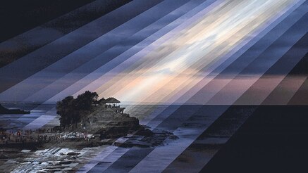
4th Response - Fong Qi Wei
My fourth development will consist of replicating the artwork of Singaporean photographer Fong Qi Wen who wanted to find a way of showing how scenes change over time without resorting to a video camera. He manipulates time-slicing in abstract ways to create an emotional response in the viewer. He strives to provoke his audience to think deeper about the familiar and the ordinary. Starting in 2013 he photographed different landscapes over a 4 hour period often as the sun was rising or setting. Combining each of these slices he then composes them to express a much longer period of time. The same slices are used more than once and often frame a central lighter area he wishes you to concentrate on.
"Most paintings and photographs are an instance of time," he said. "That's not the way the world works. We experience a sequence of time, and that's why a video is somehow more compelling than a freeze frame."
"I work in the confines of a photographic print, because I like to do so. But in a way, I wanted to break out of this restriction of a single slice of time in photography."
"I am fascinated with the intersections. Intersections are places where boundaries break down, and these are areas where really interesting things happen."
"I strive to make images which touches both the feeling part and thinking part of your mind."
|
|
I like the way Fong Qi Wei's takes a more playful approach to time slicing. He chooses to mix up the direction and size of the slices rather than all of them being the same and flowing organically across a picture like Marker Moore. He seems to create sun rays as he chooses to time slice diagonally. His approach is much more radical, almost like a Cubist painter with his collage of slices in his attempt to illustrate the passage of time in a still image. It is interesting the way a pale tone is next to a much bolder one to create a sense of atmosphere and drama. The pictures generally are a lot darker and more menacing than Marker Moore's brightly lit kaleidoscope of colours. Because Wei spends a shorter time period at a location, the palette of colours he can use are limited to low, darker hues. His pictures become interesting as he chooses a specific area to highlight, drawing attention to them rather like using a microscope. Sometimes even his dark slices have illumination contained within, like a street light, which draw the viewer in to explore what is happening. All of this encourages you to focus on each individual slice rather than scan the whole image as you would a traditional photograph. I like the way he photographs to show there is a lot of activity happening in his urban scenes. The cityscapes are packed with detail. The way he chooses to align the slices is interesting, uncovering features hidden in the shadows of the cityscapes. His clever use of framing the edges with darker areas at the sides makes the viewer's eye concentrate elsewhere but also think that the pictures was taken over the course of the day when in fact he was there for a much shorter period.
|
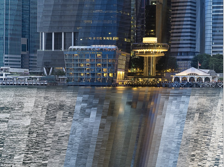
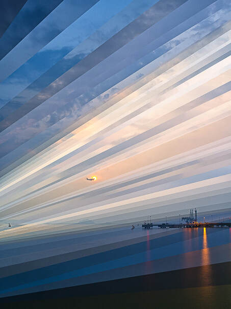
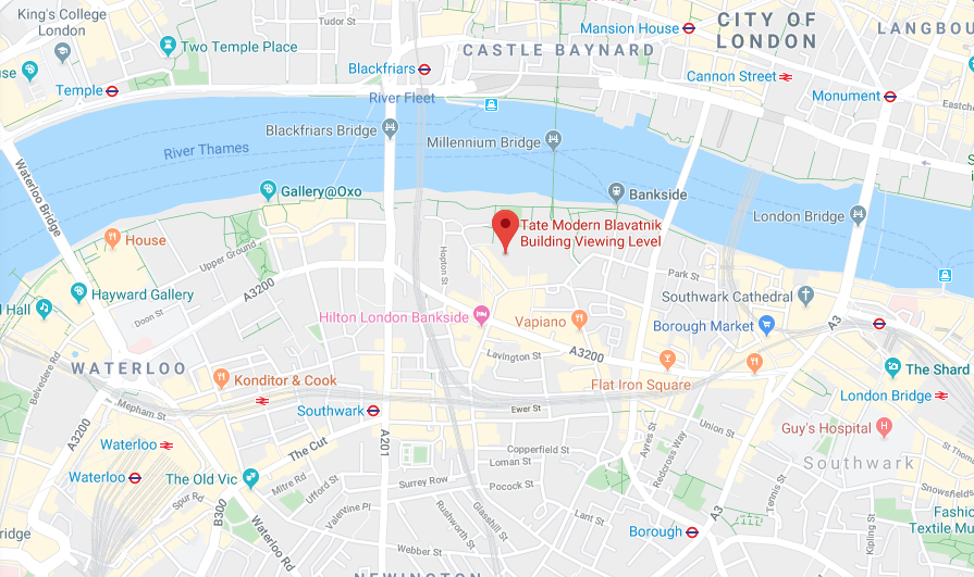
Tate Modern Viewing Platform
The Tate Modern is Britain's leading modern art gallery based in the former Bankside Power Station on the banks of The Thames. It offers tremendous views of London. Going to the top of its Blavatnik building enables people to get almost a 360 degree view of the capital. Viewers are able to admire landmarks such as St Paul's Cathedral, The Shard and Canary Wharf. Having visited it several times, I knew it would be an ideal location to complete a time-lapse of the vista of many of London's main attractions.
Source: SecretLondon |
|
Tate Modern Viewing Platform Contact Sheet
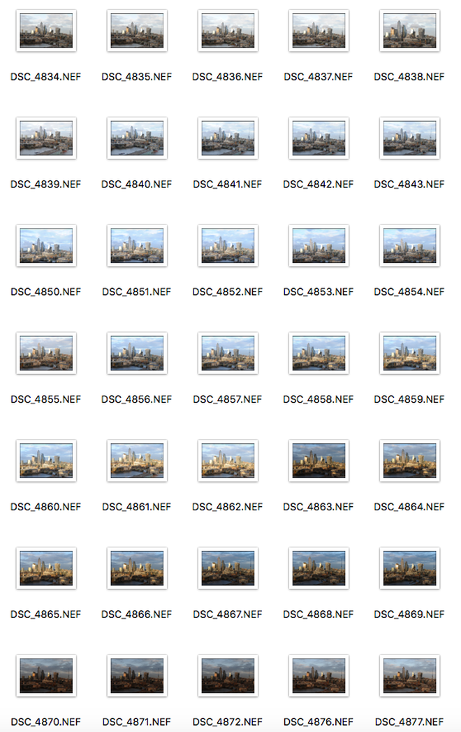
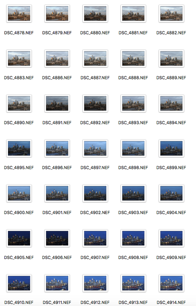
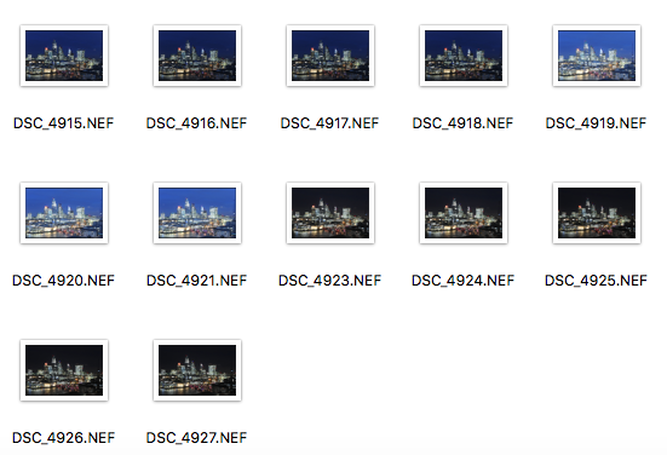
Location: Tate Modern Viewing Gallery
Time Spent: 4 hours
Images Taken: 82 images
Time Spent: 4 hours
Images Taken: 82 images
|

|
|
|
Evaluation
Overall, I believe that this first attempt at creating diagonal time slices similar to Fong Qi Wei was successful. The two pictures taken in daylight and darkness are in their own right striking, with the mixture of building shapes and sizes in the City of London perfectly visible. Like Wei, it shows there are a lot of things to concentrate on as you look closely at the image. The daylight diagonal slices look like his sun rays as they cut across the centre of the picture bathing the buildings in what looks like warm sunshine. Trying to illustrate the passage of time, the fourth dimension according to Wei, in a two dimensional picture, I used the darker areas at the top left and bottom right to frame the image indicating a 24 hour cycle, I used the same process in Photoshop as I did with my original Dan Marker Moore pictures except changing their direction, slicing diagonally the image with different sizes rather than vertically in broad uniform slices. I was fortunate with the weather as the low winter sun brightly lit the skyscrapers. The image certainly would not look so effective on a cloudy day.
Overall, I believe that this first attempt at creating diagonal time slices similar to Fong Qi Wei was successful. The two pictures taken in daylight and darkness are in their own right striking, with the mixture of building shapes and sizes in the City of London perfectly visible. Like Wei, it shows there are a lot of things to concentrate on as you look closely at the image. The daylight diagonal slices look like his sun rays as they cut across the centre of the picture bathing the buildings in what looks like warm sunshine. Trying to illustrate the passage of time, the fourth dimension according to Wei, in a two dimensional picture, I used the darker areas at the top left and bottom right to frame the image indicating a 24 hour cycle, I used the same process in Photoshop as I did with my original Dan Marker Moore pictures except changing their direction, slicing diagonally the image with different sizes rather than vertically in broad uniform slices. I was fortunate with the weather as the low winter sun brightly lit the skyscrapers. The image certainly would not look so effective on a cloudy day.
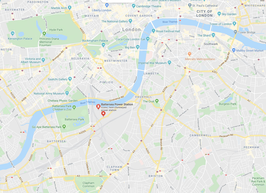
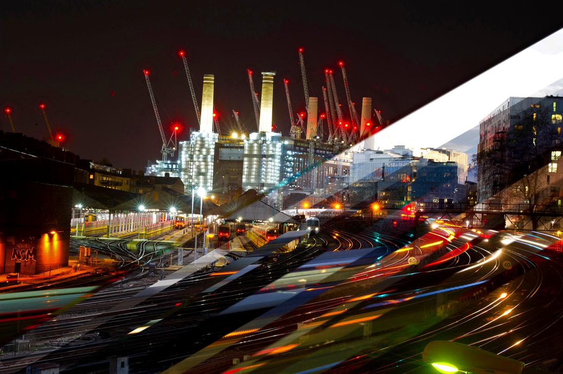
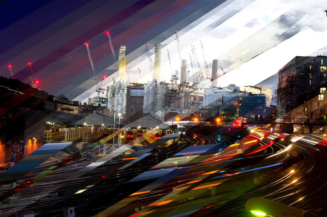
Battersea Power Station
|
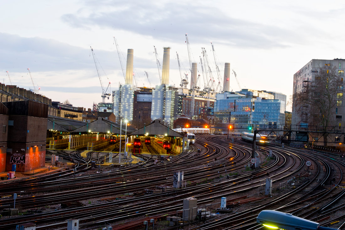
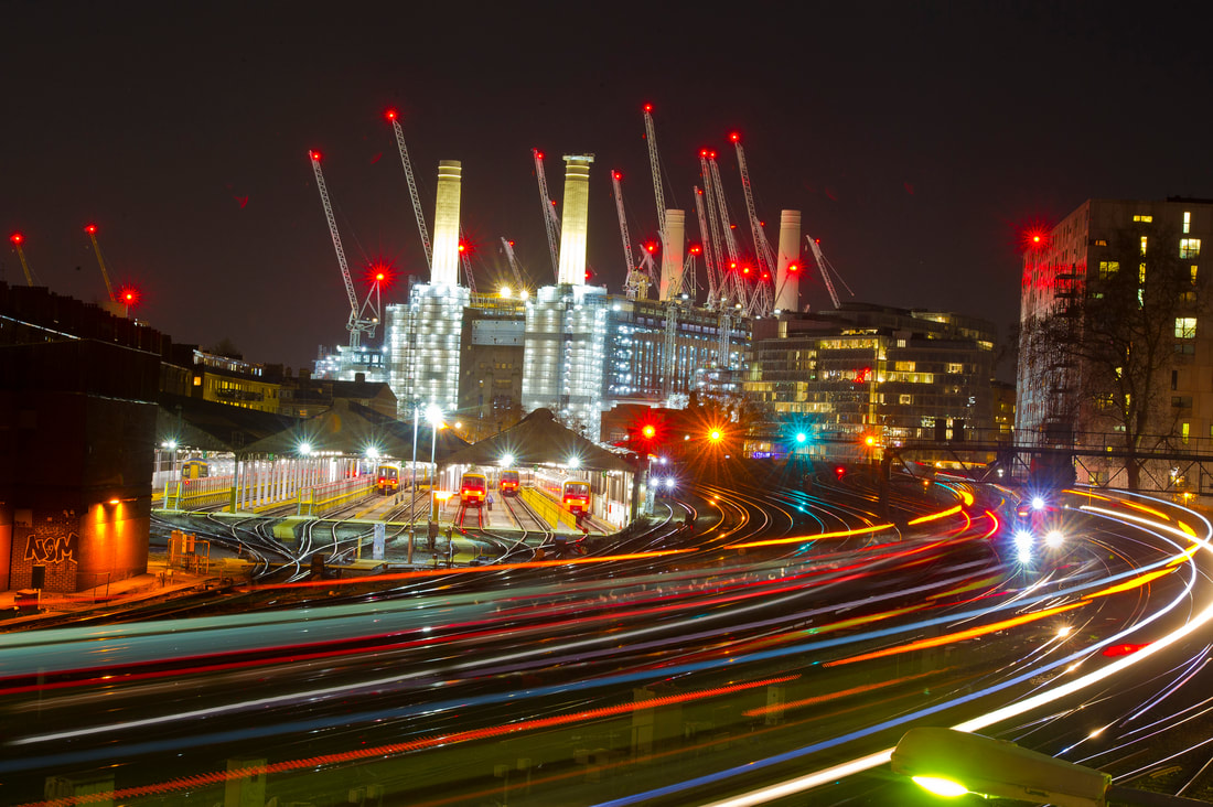
The iconic Battersea Power Station is a decommissioned coal-fired power station famous for its four tall white chimneys and Art Deco interior. It is currently a major building site featuring tall cranes as it is being converted into luxury apartments. I knew it would make a great subject within an image. It is located in South London adjacent to the railway tracks near Victoria train station. I was hoping that I would be able to capture some of the brightly lit trains passing by. This is because the onboard lights can make interesting patterns due to the long exposure that will be used.
Source: Wikipedia and nineelmslondon |
|
Battersea Power Station (from Ebury Bridge) Contact Sheet
Location: Ebury Bridge facing Battersea Power Station
Time Spent: 3 hours
Images Taken: 91
Time Spent: 3 hours
Images Taken: 91
|
|
Evaluation
This shoot was very successful as I managed to achieve my target of getting the colourful 'light trails' running across the images as well as a clear juxtaposition between the dull tone during the day and the exciting hue of that the night caused. Having a slow shutter speed of 30 seconds and an aperture of f22 using a 24mm lens enabled me to make the most of capturing the limited number of trains that are permitted at one time. The "stop and go" green, yellow and red lights in the centre of the image nicely breaks up the transition from the tracks to the building. Not only that, but the light shining from the iconic Battersea Power Station, the illuminated open railway siding where the trains are stored faces the camera and the lights shining from the construction cranes adds a sense of urbanisation to the picture, making it much more captivating.
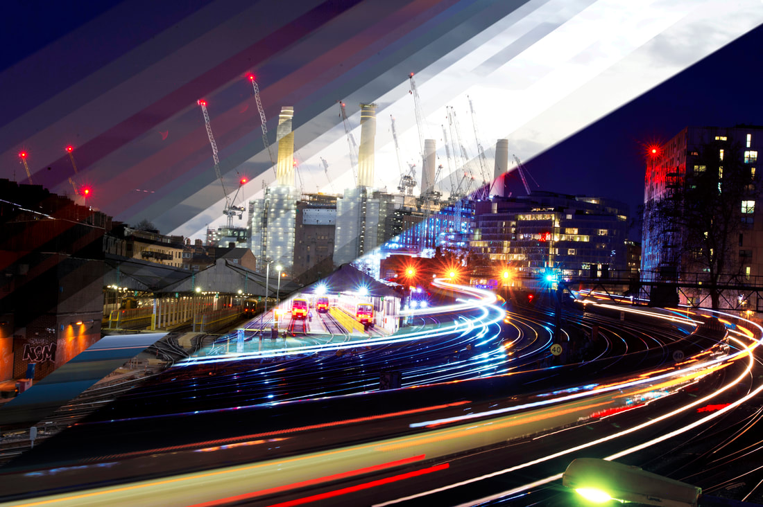
I think I have captured a scene where there is a lot information to take in just like a photograph taken by Qi Wei. Other than the light sources, the train tracks lead the viewer's eye to the Power Station, a metaphor for a time-lapse whereby the viewer's eyes are taken on journey from day to night across the image. Using a tripod (that needed to be held due to the vibrations of the trains) and a fixed focus lens ensured that each image would have the exact same framing. The still images worked well and I was particularly pleased with the final night time shots, however I want to experiment with slicing to see if I can get it more like Wei's with a sense of drama or atmosphere. In the image below the central diagonal slices are too pale to the overall composition - there is not enough detail compared with the rest of the picture. They break up the photograph in two parts. My future challenge will be to keep the daylight slices in the image but not let them be too dominant or distracting.
This shoot was very successful as I managed to achieve my target of getting the colourful 'light trails' running across the images as well as a clear juxtaposition between the dull tone during the day and the exciting hue of that the night caused. Having a slow shutter speed of 30 seconds and an aperture of f22 using a 24mm lens enabled me to make the most of capturing the limited number of trains that are permitted at one time. The "stop and go" green, yellow and red lights in the centre of the image nicely breaks up the transition from the tracks to the building. Not only that, but the light shining from the iconic Battersea Power Station, the illuminated open railway siding where the trains are stored faces the camera and the lights shining from the construction cranes adds a sense of urbanisation to the picture, making it much more captivating.
I think I have captured a scene where there is a lot information to take in just like a photograph taken by Qi Wei. Other than the light sources, the train tracks lead the viewer's eye to the Power Station, a metaphor for a time-lapse whereby the viewer's eyes are taken on journey from day to night across the image. Using a tripod (that needed to be held due to the vibrations of the trains) and a fixed focus lens ensured that each image would have the exact same framing. The still images worked well and I was particularly pleased with the final night time shots, however I want to experiment with slicing to see if I can get it more like Wei's with a sense of drama or atmosphere. In the image below the central diagonal slices are too pale to the overall composition - there is not enough detail compared with the rest of the picture. They break up the photograph in two parts. My future challenge will be to keep the daylight slices in the image but not let them be too dominant or distracting.
|
|
Evaluation
I have tried to create in my final piece a more abstract interpretation using the time slices. Using the train tracks, I have chopped up the slices so they appear frenzied and chaotic indicating motion and speed. The trains leaving and entering Victoria Station are blurred as they sweep by. This is my attempt to display time like Fong Qi Wei as a fourth dimension using only a two dimension picture using the hustle and bustle of a busy train station in an urban environment with a striking industrial backdrop of the old power station. Maintaining a gentle transition of the night time slices on the top of the image is a sharp juxtaposition to the chaos of colour caused by the high frequency public transport system. The central diagonal is not too distracting in this image as the disjointed slices at the bottom lead the eye away. When using Photoshop, it was difficult to combine the two halves of the diagonal slicing as the different sizes used caused some not be parallel when aligned (noticeable on the power station chimneys), consequently it proves that if done again in the future, I will do it in one go.
I have tried to create in my final piece a more abstract interpretation using the time slices. Using the train tracks, I have chopped up the slices so they appear frenzied and chaotic indicating motion and speed. The trains leaving and entering Victoria Station are blurred as they sweep by. This is my attempt to display time like Fong Qi Wei as a fourth dimension using only a two dimension picture using the hustle and bustle of a busy train station in an urban environment with a striking industrial backdrop of the old power station. Maintaining a gentle transition of the night time slices on the top of the image is a sharp juxtaposition to the chaos of colour caused by the high frequency public transport system. The central diagonal is not too distracting in this image as the disjointed slices at the bottom lead the eye away. When using Photoshop, it was difficult to combine the two halves of the diagonal slicing as the different sizes used caused some not be parallel when aligned (noticeable on the power station chimneys), consequently it proves that if done again in the future, I will do it in one go.
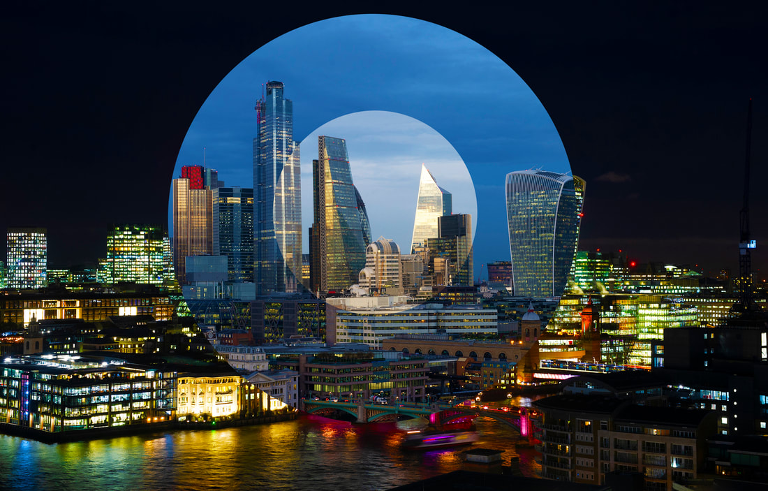
5th Response - Carl Antonyn Dufault
To further develop the idea of combining night time and daytime images together I will use the techniques of contemporary Canadian Photographer, Carl Antonyn Dufault.
He produced a series of photographs called 'Jour Nuit' (Day Night) where he shot the same cityscape scene at different times of the day. However, unlike Marker Moore and Fong Qi Wei, who use multiple images, he chooses to use just two pictures, one in sunshine - often at brightest time of the day, the other in the evening. Blending the two together with a bold circle contrasting the two scenes. He tries to illustrate how much the urban space can change in a few hours only. These are often exhibited as a pair, not only to show the differences in colours that change during the day, but the human perceptions of the city at different hours. He tries to destabilise the viewer by asking, "would you like to visit here, and if so when, during the day or at night? Do you prefer to be in the centre or on the periphery, which do you find more appealing?" Like Qi Wei and Moore using the composite pictures really does encourage focus on specific areas because there is so much detail often in the shadows.
"Through his photographs, he proposes his reflexion on the importance of context, time and the impact of citizens on the shape and form they give to their cities. His work suggests contrasts, offering new perspectives on the built environment around us."
Source: Lemonframe.com
|
|
|
|
|
|
I like the way Dufault's images create the sense that you are an outsider always looking in on a strange environment. He does not immerse himself in the city but shoots the pictures from a distance, on a wide angle lens from a high vantage point and often over rooftops. The circular portion of the picture is very much like looking through a telescopic sight.
Very few people are in the pictures, only travelling cars give the impression of human activity. The photographs show the city as a hostile environment, particularly those shot during the daytime. He manages to convey how hot the temperature may be by the lack of anyone walking the streets. This is amplified by his use of high key exposure. I like the cloudless skies which do not detract from the shape and form of the city below.
The pictures also have a timeless quality about them. It would be difficult to say when they were shot unless you had some more information. The cars are so small they cannot be used to identify a period. The only clue would be if you knew when certain buildings were built. The shots also do not really give an indication which cities they are taken in. He does not use notable landmarks to illustrate his ideas. Rather than some iconic or famous structure, he photographs what could be considered nondescript street scenes. When he publishes the picture he often just remarks that he has been travelling on the West Coast of USA or the Far East. He sometimes offers little insight into where the images are shot. And perhaps importantly why he shot that particular scene as sometimes there is not anything obvious to explain his motives. I like the way he does not photograph the dramatic city scenes with award winning extravagant buildings but rather more functional places where nothing particularly important looks like to be happening. He chooses to make them the stand out feature and centre of attention rather than a tall
glass and metal buildings that dominate parts of wealthy city areas.
This singular focus on ordinary buildings may be due to his training as an architect. I find it interesting that he does not illustrate any warmth or affinity to the city. He chooses not to show it in a friendly or sociable way. Although the city is a place where fun and entertainment can be found, Dufault avoids that and chooses to show the bleak functioning urban environment instead. He shoots near freeways, construction zones and areas where people are in transition from one place to the next, not pedestrian zones, bars or cafes where humans can interact.
Using my Canary Wharf pictures for my first attempt seemed appropriate as the buildings look stark and unwelcoming. Nobody was on the pavement, just as in Dufault's work. Unfortunately the weather was rather cloudy so I could not give the impression of how hot or cold it was. It is hard to get an elevated position in this part of Docklands as all the buildings are private so I had to make do with shooting from the ground. My night picture had some office lighting so it made a good contrast with a day time shot but was such a strong colour because of the weather that the image of night time in the circle was rather distracting.
My main problem was getting enough of the buildings in the picture like the photographer does. Next time I will choose a different location because the results, although technically OK, the finished pictures do not really look like you are on the outside looking in as in Dufault's wide images.
My main problem was getting enough of the buildings in the picture like the photographer does. Next time I will choose a different location because the results, although technically OK, the finished pictures do not really look like you are on the outside looking in as in Dufault's wide images.
South Key
|
|
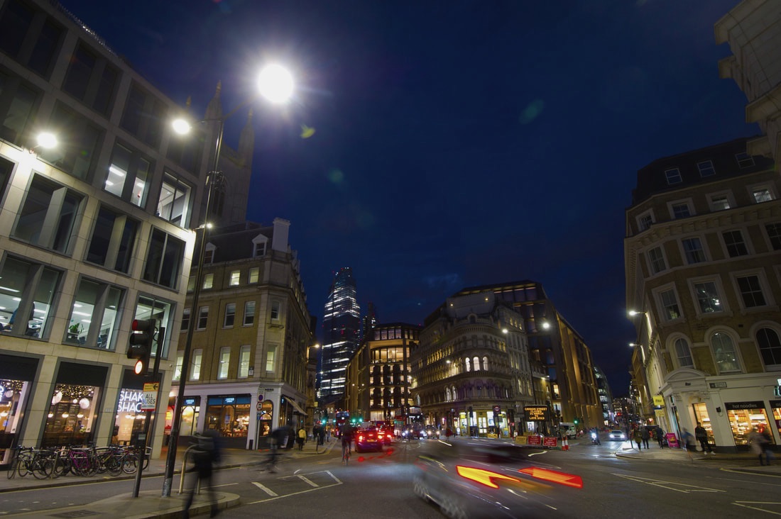
Cannon Street
|
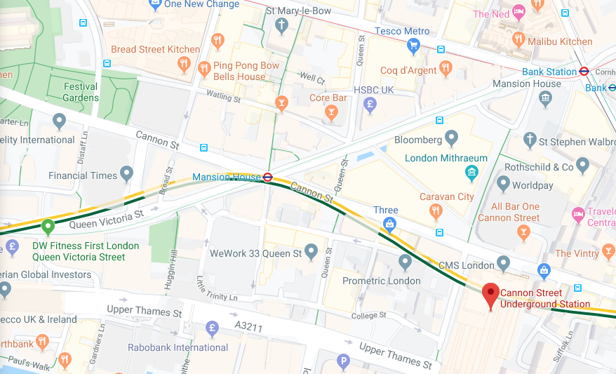
Cannon Street is a road in the City of London that runs roughly parallel with the River Thames and has historical significance, being the site of the ancient London Stone that is possibly of Roman origin. I decided to revisit this area as I believe it is a perfect depiction of the essence of the city due to its bustling streets during both the day and night.
Source: Wikipedia |
|
Cannon Street Contact Sheet
Enlargements
Cannon Street Day Original Image
|
|
Cannon Street Day Final Edit

Cannon Street Night Original Image
|
|
Cannon Street Night Final Edit
|
|
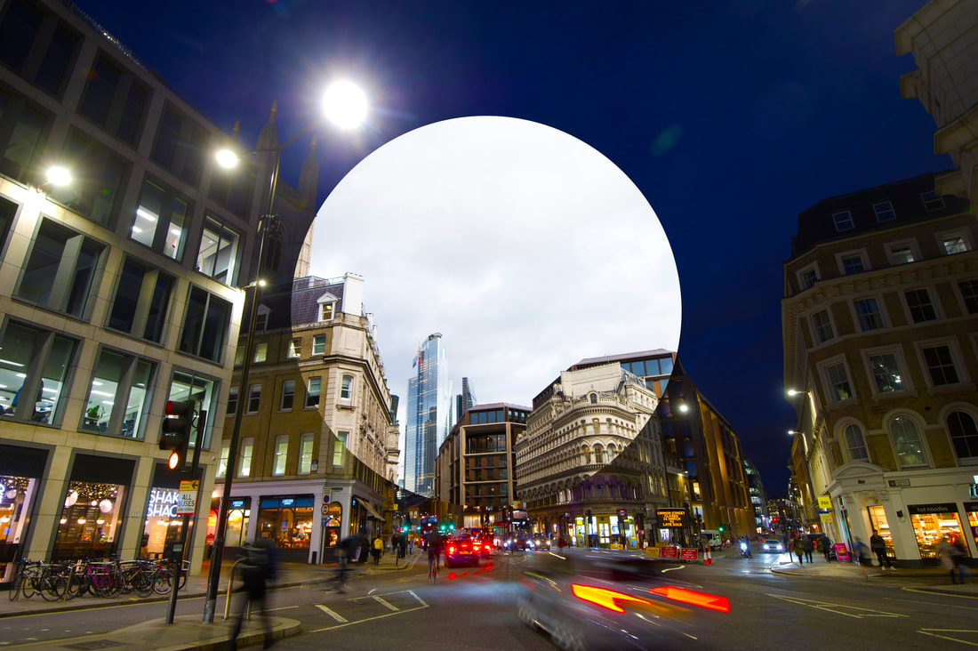
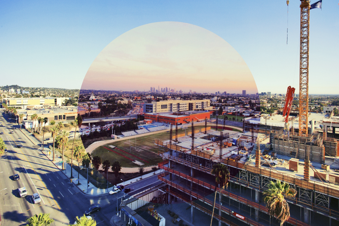
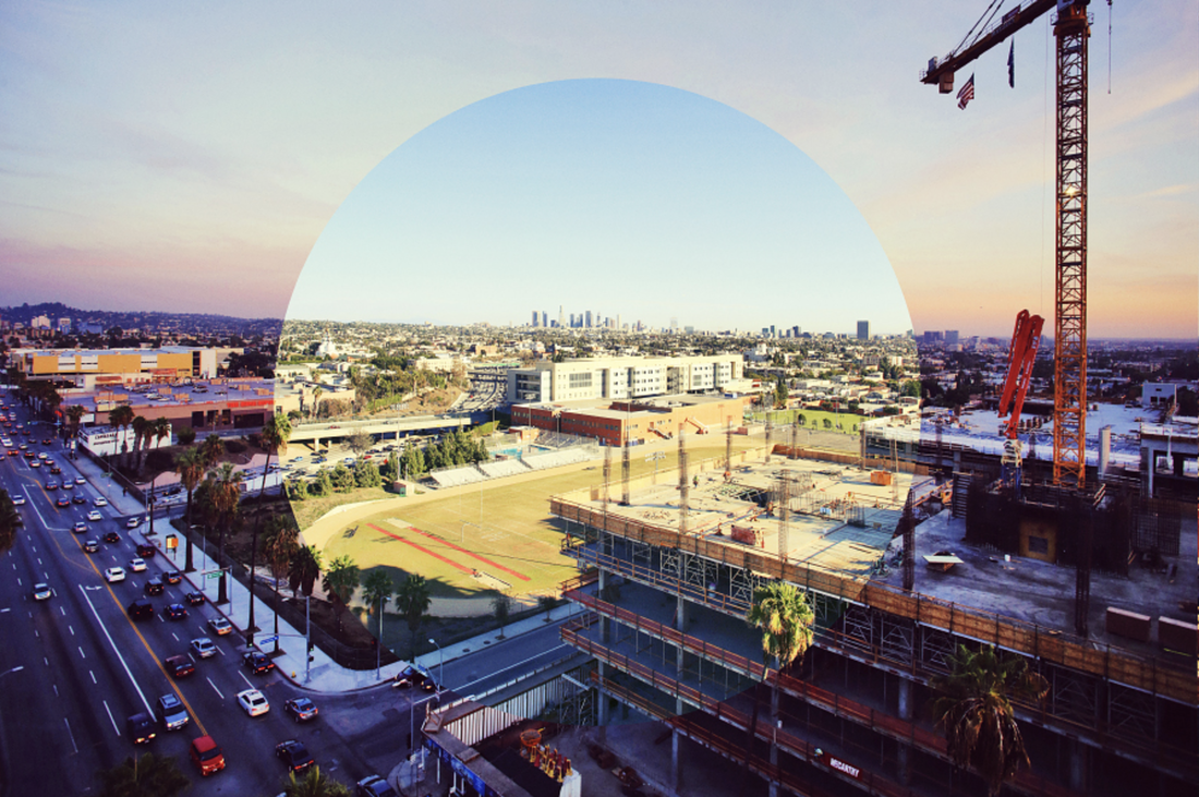
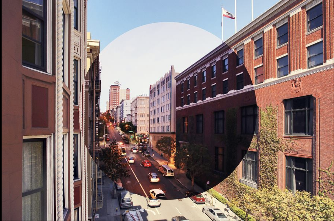
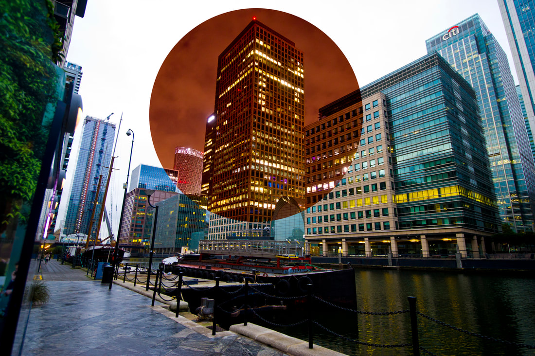
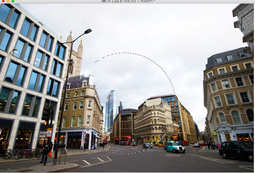
Cannon Street with Day Circle Inspired by Carl Anthony Dufault
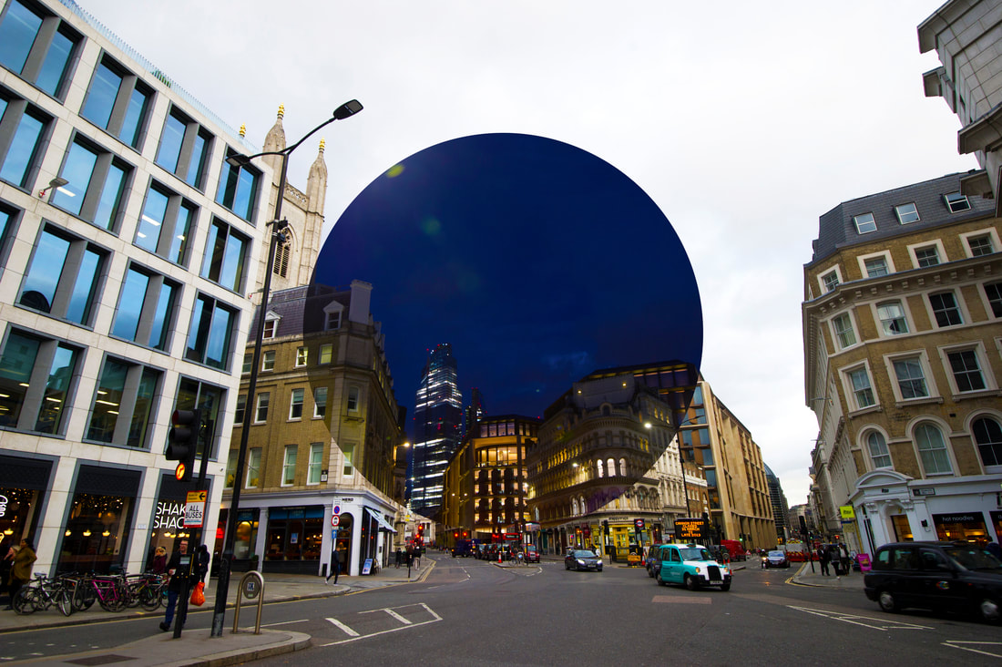
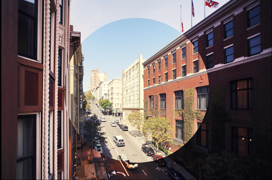
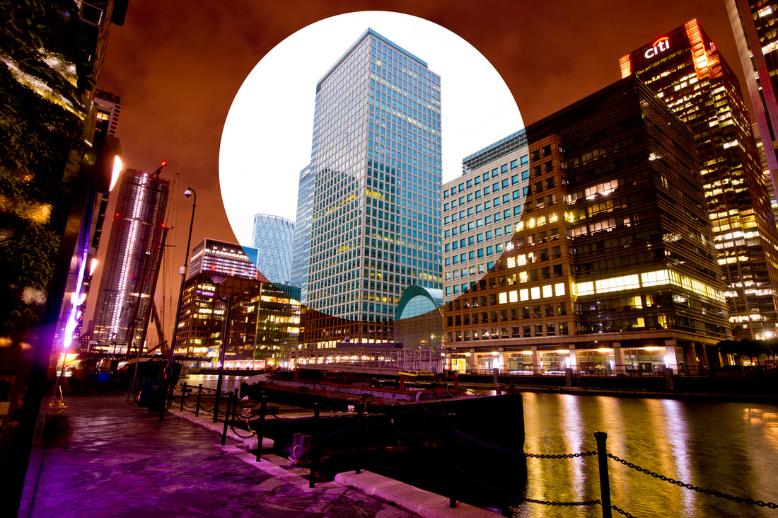
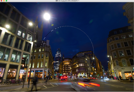
Cannon Street with Night Circle Inspired by Carl Anthony Dufault
Evaluation
I was happy with this shoot as I captured the exact same location for several hours using correct shutter speeds and apertures. I was pleased with the lack of pedestrians at this busy junction as Dufault's images rarely feature people, and with the fact that I managed to get cars and buses rushing by in the picture. It provides a good interpretation of his ideas that the city can change significantly in only a few hours. I think the location worked better and the colours were an improvement on my previous effort. Like Dufault's work, it does not look a particularly pleasant environment to be in. However, due to my framing, the majority of the picture is taken up by sky, meaning a lot of the time lapsed circle is slightly dull. Therefore for future projects, I will ensure there is a good balance between interesting structures and the sky, and shoot down on the scene.
I was happy with this shoot as I captured the exact same location for several hours using correct shutter speeds and apertures. I was pleased with the lack of pedestrians at this busy junction as Dufault's images rarely feature people, and with the fact that I managed to get cars and buses rushing by in the picture. It provides a good interpretation of his ideas that the city can change significantly in only a few hours. I think the location worked better and the colours were an improvement on my previous effort. Like Dufault's work, it does not look a particularly pleasant environment to be in. However, due to my framing, the majority of the picture is taken up by sky, meaning a lot of the time lapsed circle is slightly dull. Therefore for future projects, I will ensure there is a good balance between interesting structures and the sky, and shoot down on the scene.
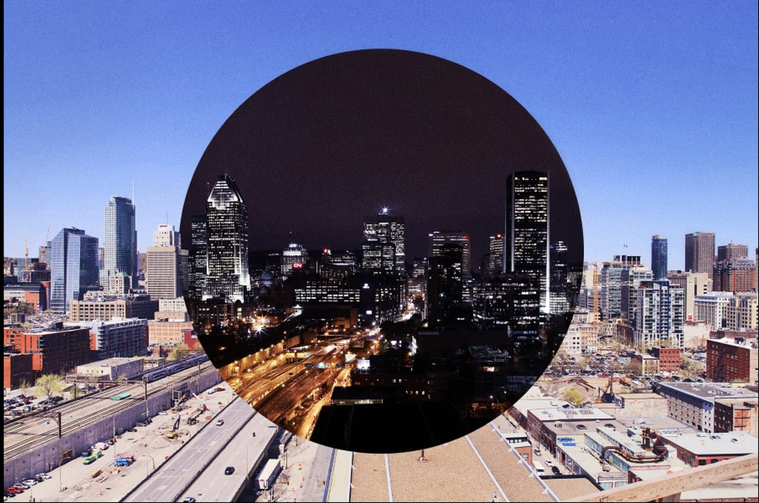
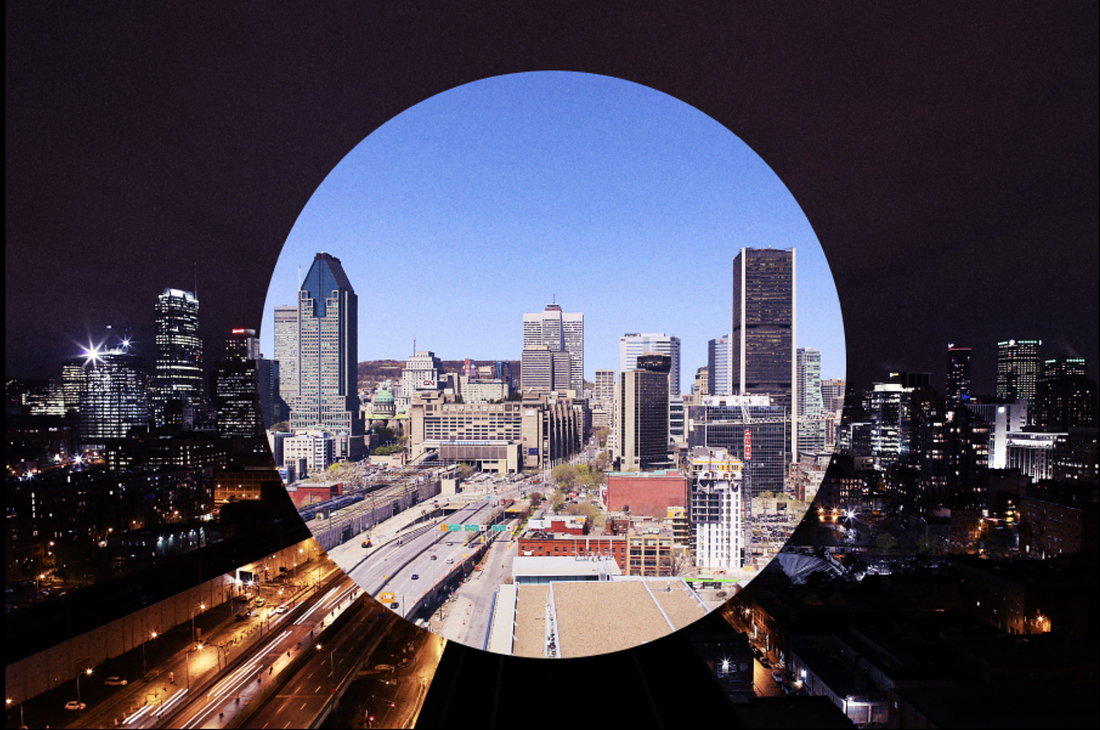
To experiment with Dufault's ideas, I tried using more than one telescopic type circle. Based on the seasons, my idea was to develop the small day scene into a slightly larger evening circle, which is then enveloped by a much bigger night scene. This was to illustrate how short the daytime hours were in winter and how much more time we experience being in the dark at this time of the year.
City of London
|
|
|
Evaluation
I consider this interpretation of Dufault's work technically successful and a good representation of what I wanted to achieve. Even without using a tripod I managed to keep the camera still enough to capture the scene sharply using a small aperture. There are eye-catching, vibrant colours along with an even ratio between the day circle and the night circle. There is a clear difference between each section and all the buildings are in line with one another, making it much more effective. It shows the urban environment well and the influences of the people living and working here. If I was to shoot the scene in summer, I could reverse the ratio of the circles and have the main portion of the scene covered in daylight, illustrating more sunlight hours. The added bonus was shooting from such an elevated position which is similar to Dufault's work, with the viewpoint of an outsider looking in at the city.
I consider this interpretation of Dufault's work technically successful and a good representation of what I wanted to achieve. Even without using a tripod I managed to keep the camera still enough to capture the scene sharply using a small aperture. There are eye-catching, vibrant colours along with an even ratio between the day circle and the night circle. There is a clear difference between each section and all the buildings are in line with one another, making it much more effective. It shows the urban environment well and the influences of the people living and working here. If I was to shoot the scene in summer, I could reverse the ratio of the circles and have the main portion of the scene covered in daylight, illustrating more sunlight hours. The added bonus was shooting from such an elevated position which is similar to Dufault's work, with the viewpoint of an outsider looking in at the city.
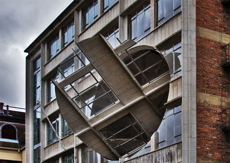
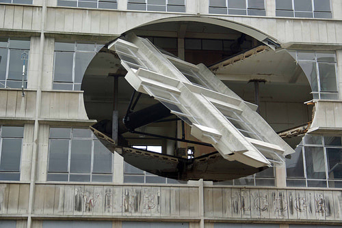
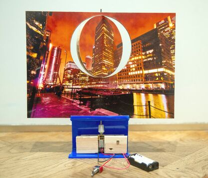
6th Response - Richard Wilson
I decided to illustrate night photography in a more physical way, prompted by the incredible work of the British sculptor and installation artist Richard Wilson.
I printed my Dufault inspired images of Canary Wharf and glued them to either side of a piece of plywood with a circular middle section cut free. Then, using an electrical motor, made the circular edit spin continuously so there are times where there is either day or night, as well as times of a contrast between the two. This idea was inspired by Wilson's extraordinary work 'Turning the Place Over', as demonstrated below. Here he creates a powerful feeling of disorientation and danger by cutting free a 10 metre oval section in the facade of an abandoned building in Liverpool and rotating it continuously. He achieved this effect by mounting the section on a central spindle with attached industrial motorised rollers which rotated it 360 degrees. This astonishing feat of engineering physically encroaches on passers-by in the street as the disc turns, literally turning inside out during its constant cycle. I found this effect on such a grand scale quite unsettling but also exhilarating, and would have liked to have seen it in operation. The extraordinary and precise way the lines of the building complete and break apart as the isolated cut-out transitions is another of the features I am trying to achieve with my model as day and night change places.
"Wilson's preference is for large scale phenomenological interventions in which viewers can become fully immersed, sometimes deliberately risking their safety along the way."
"It is a dangerous and dramatic work, and all the more powerful given the run-down quality of the building."
Source: EdinburghFestival
|
|
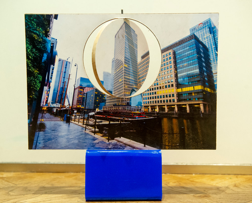
My response
|
|
Evaluation
I am pleased with this more practical aspect of my overall theme of comparing night and day. This is my first time using such technicality without the use of Photoshop, and the final product turned out how I envisioned it. Here the circle is constantly spinning at a controllable pace, meaning some occasions both sides of the image are all day/night whilst other times there is a mashup between the two environments, relating to Dufault's work. The process consisted of printing my two chosen images on to two different pieces of plywood and using the laser cutter, cutting out an even circle in the middle. Next, I combined the images (with a hole in the middle) using aerosol glue with a rod in the middle of it. This was attached to a motor enabling the 3D photo-circles to spin in unison. If I was to improve this, I would to have liked to make it more sizeable to make the piece more visually impressive as printing the image onto an 8.27 X 11.69 inched piece of wood, made the whole idea less effective. If done again I would perhaps do it on pieces of wood 16.5 x 23.4 inches as well as make the whole background spin rather than just the circle to create more of a sense of disorientation.
I am pleased with this more practical aspect of my overall theme of comparing night and day. This is my first time using such technicality without the use of Photoshop, and the final product turned out how I envisioned it. Here the circle is constantly spinning at a controllable pace, meaning some occasions both sides of the image are all day/night whilst other times there is a mashup between the two environments, relating to Dufault's work. The process consisted of printing my two chosen images on to two different pieces of plywood and using the laser cutter, cutting out an even circle in the middle. Next, I combined the images (with a hole in the middle) using aerosol glue with a rod in the middle of it. This was attached to a motor enabling the 3D photo-circles to spin in unison. If I was to improve this, I would to have liked to make it more sizeable to make the piece more visually impressive as printing the image onto an 8.27 X 11.69 inched piece of wood, made the whole idea less effective. If done again I would perhaps do it on pieces of wood 16.5 x 23.4 inches as well as make the whole background spin rather than just the circle to create more of a sense of disorientation.
7th Response - Paul Reiffer & Simon Bond
My final response to investigating the chosen theme of creative night photography is to explore the unique techniques used by two National Geographic photographers, Paul Reiffer and Simon Bond, for an alternative view of image composition. Their world-renowned work has been an inspiration as the pictures they create are so visually arresting. I find them inspiring because they have fun and push the boundaries of traditional composition and long held principles of photography.
Reiffer says, "As someone who's inclined to shoot literal scenes of landscapes and cityscapes every day, it's good to try something completely different, just to mix up the thought process a little. Our fascination with ultra wide angle photography has spanned for decades. Capturing images with a greater field of view than that offered by the human eye provides an escape from normality - a perspective on the world which almost appears unreal."
The photographers capture these images with the use of a highly polished glass sphere that creates a small distorted image of the location within the glass ball. The Laws of Refraction (see below) cause this image to be inverted and the results are often stunning to look at. The wide angle effect is in part similar to a fish-eye lens which records large areas, bending the structures and light forms. The photographers shoot pictures with this technique during the day, but crucially to me, also at night. Whole scenes of urban life are recorded in a most unusual way. Positioning the ball in front of a variety of brightly lit objects creates a twisted mirror image of that same scene often transforming what would normally be a rather bland picture. The photographers use different techniques, sometimes rotating the whole image 180 degrees to ensure the small "glass image" is then in its correct upright position, or just manipulating the image inside the ball so not changing the position of the lensball in the frame. The resulting effect of these skills show how even a photograph viewed upside down can be interesting to look at. Often the two opposite images compliment each other.
My previous work has been primarily performed in Photoshop, blending and merging earlier images I've shot together, creating a two dimensional image of composite parts. This development, although in many ways similar to the previous one, creates the two images at the same time in the camera rather than on a computer. It is an ideal response as it correlates with my other work inspired by Dufault, as the second image, like his, is similarly a circle.
Technically, the project is challenging: subjects need to be well illuminated, focussing on the glass ball takes some practice, a tripod is needed so that restricts viewpoint (I won't be able to shoot too high or low), good weather is crucial as raindrops on the ball ruin the small image, the ball is heavy and needs constant cleaning and a stable surface. Also, since the image is 360 degrees, I need to be in the shadows or a dark area otherwise I may be visible in glass image. I need to take account of all these all these factors but with some planning I hope to produce images similar to them.
|
Paul Reiffer
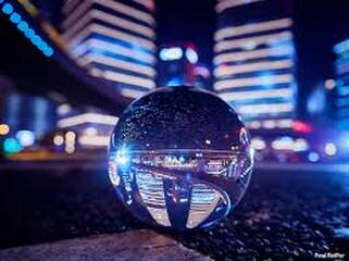
|
Simon Bond
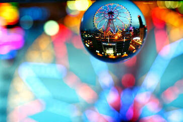
|
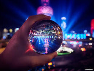
|
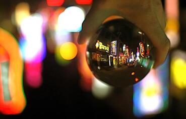
|
Reiffer and Bond use almost identical methods, searching for brightly lit interesting subjects to shoot. I particularly like the images produced when the ball is placed by the photographers at a location rather than hand held.
Looking closely at the pictures above, it is clear they do differ in their approach to the depth of field, and the portions of the image that are in focus. Focussing is affected by aperture, distance from camera to subject, and the focal length of the lens used. The focussing of the image in the lensball is critical. With the curvature of the glass it is difficult to get a pin sharp image all over the lensball so you have to pick areas out that are most interesting.
Bond photographs using lenses set at a very shallow depth of field (f2.8/f4) which causes a blurrier background to the main picture, making his images more abstract and causing the viewer's eye to only focus on the content within the glass ball. The glass ball is the main interest to him in the picture. The pleasing look of the blurred out of focus lights in the background is referred to as bokeh. It comes from the Japanese word 'boke' which means 'blur'. Different lenses produce different amounts of bokeh, so I am going to experiment to get the best effect. This is particularly interesting to look with the hand held ball pictures when that image is then rotated so the ball image is upright.
Reiffer on the other hand, uses a greater depth of field (f5.6/f8) which results in the background of the image being more visible, adding more detail and subject matter into the image. The ball is in the environment adding to the overall image, not distracting from it. I will experiment with both techniques as I believe that some images will look more effective with an out of focus background and some with a more recognisable background. Also, I am going to try rotating just the image in the glass ball with photoshop so both images are the same way up.
What is Refraction?
Refraction involves the changing of the direction of waves passing from one area to another. Refraction dictates that light passing through a medium will bend or “refract”. Some objects placed in the path of a light source will bend light a little. This is demonstrated in Reiffer's and Bond's method whereby a glass sphere actually inverts the light so what was upright will appear in the lens to be upside down. I have illustrated this below by photographing a wine glass containing water in front of a pattern of diagonal lines printed on a piece of A4 paper. These images show that the direction of the lines altered as light passes through the wine glass, demonstrating the law of refraction. The lensball refracts the light so much that it inverts any image taken through it and is made of a particularly good quality K9 glass so hopefully the pictures will be much sharper than the wine glass image.
Refraction involves the changing of the direction of waves passing from one area to another. Refraction dictates that light passing through a medium will bend or “refract”. Some objects placed in the path of a light source will bend light a little. This is demonstrated in Reiffer's and Bond's method whereby a glass sphere actually inverts the light so what was upright will appear in the lens to be upside down. I have illustrated this below by photographing a wine glass containing water in front of a pattern of diagonal lines printed on a piece of A4 paper. These images show that the direction of the lines altered as light passes through the wine glass, demonstrating the law of refraction. The lensball refracts the light so much that it inverts any image taken through it and is made of a particularly good quality K9 glass so hopefully the pictures will be much sharper than the wine glass image.
Diagonal lines without refraction
|
Refracted diagonal lines in centre of wine glass
|
My main aim is to make the finished picture an improvement or alternative view to the original. This will be done in a number of ways:
1. Choosing the subject matter and lens carefully.
2. Positioning the ball in a certain way - Bond and Reiffer occasionally hold the lens ball.
3. Making sure the shape of the sphere does not interrupt the flow of the image and improves the final image.
4. Ensuring the horizon in the secondary image is an appropriate place to the main photograph.
|
Isle of Dogs
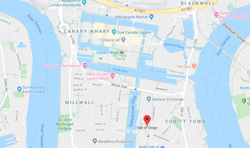
|
Tower Bridge
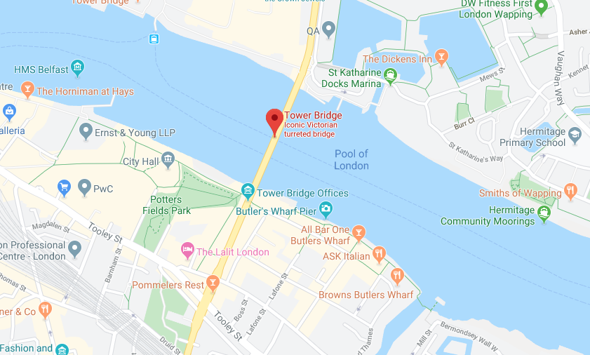
|
Central London Lensball Contact Sheet 1
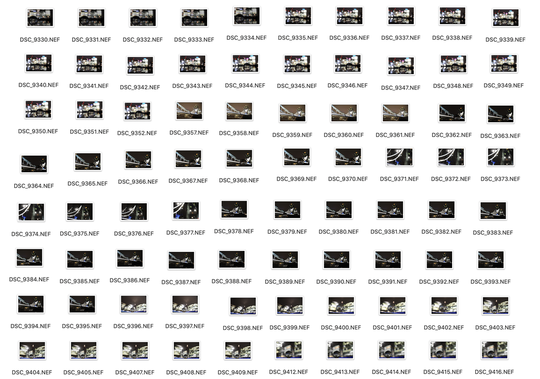
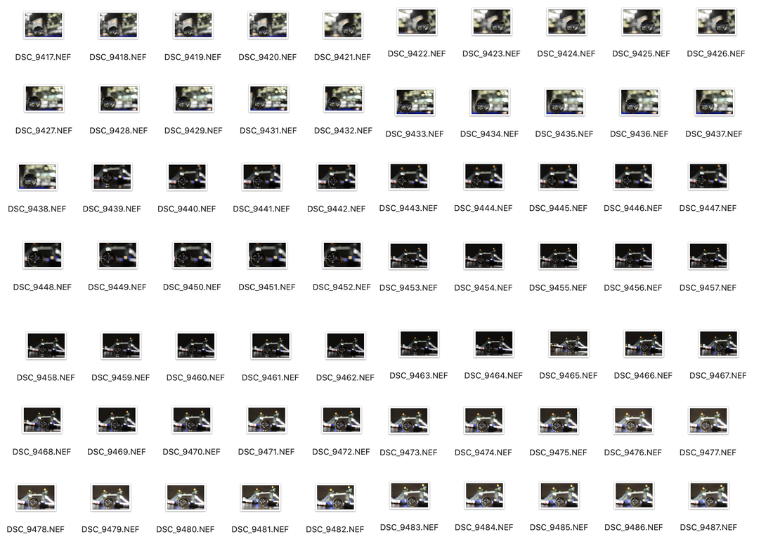
Canary Wharf from Isle of Dogs
Using Google Maps, I researched where some of the buildings in Canary Wharf would be reflected at night time in some of the waterways and quays of Docklands. Having never photographed the ball I knew I needed to plan how to use it most effectively so I went to the specific location in the late afternoon, giving myself lots of time as I did not want to miss the light changing, as well as giving me an idea of what it would look like at night. I framed the best view of the skyscrapers I could get in the ball and waited for the light to drop. My main issue was not being able to use my tripod as I needed an extremely low vantage point to get the whole scene in the sphere, resting my camera on my camera bag was the only option. I was hoping that because the buildings and their reflections illuminate so brightly my exposures would not need to be so low causing camera shake. The gradual lowering of the light can be seen in the first two enlargements.

|
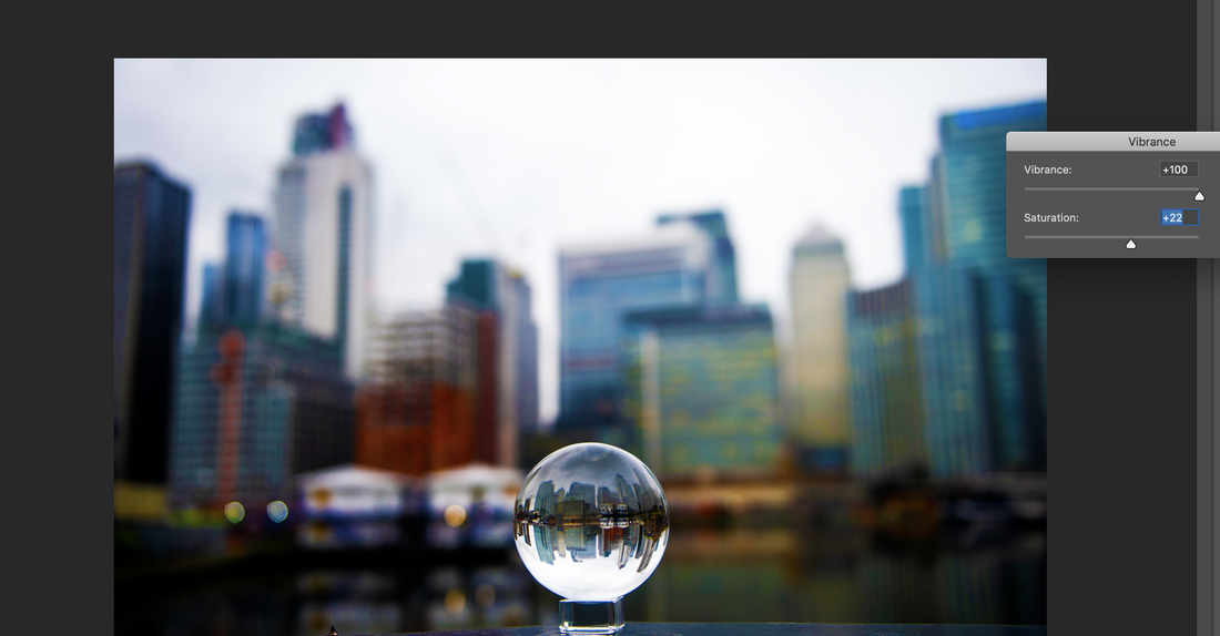
|
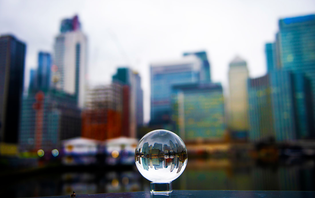
Canary Wharf photographed at 3:00PM with lensball in place
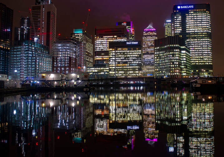
Canary Wharf photographed at 5:30PM
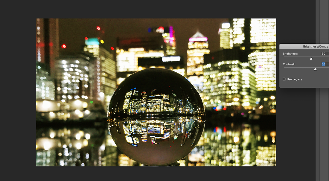
|
|
Canary Wharf with lensball applying exposure compensation
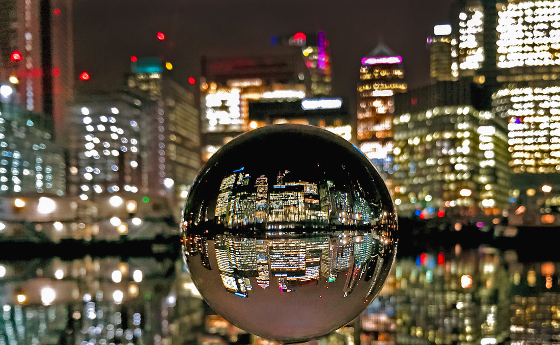
Canary Wharf Final Edit
For the first enlargement of Canary Wharf from The Isle of Dogs, the backdrop of the buildings could be seen impressively on a wide angle lens, but the ambience during the late afternoon was very gloomy and I was not able to capture the sky as a rich, royal blue colour before it went pitch black (Simon Bond refers to this as the golden time). However once dark, the reflected lights from the skyscrapers appeared impressively in the water of Blackwall Basin, and captured in the lens ball (second enlargement). I like the way the upright buildings in the lensball image are actually the reflection of the buildings and not the buildings themselves - a nice twist on conventional architecture photography. I was slightly concerned when taking the picture that the water was moving so fast (see above night picture without lensball) that the lights would not be seen very clearly, but the motion has nicely distorted the lights in the main picture, however in the sphere that is not so noticeable.
Canary Wharf Winter Lights Installation
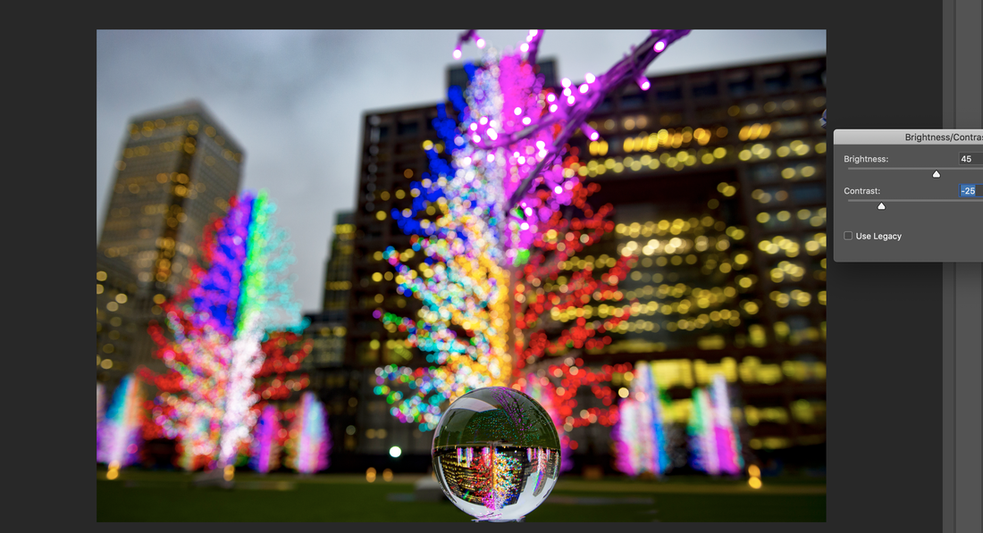
|
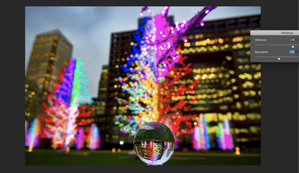
|
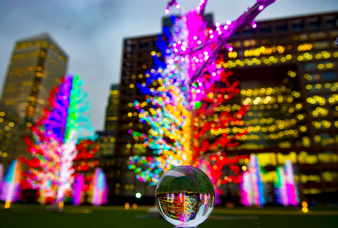
Canary Wharf Lights Installation Final Edit
In these next two images, I inverted the contents within the glass ball 180 degrees as I believe it makes the image far more effective - the Christmas tree is the correct way up. The process consists of using the measurements of the glass ball, the eliptical tool, creating a new layer, copying and pasting, followed up by rotating.
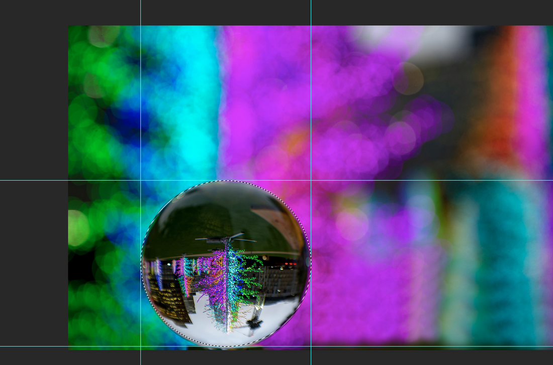
|
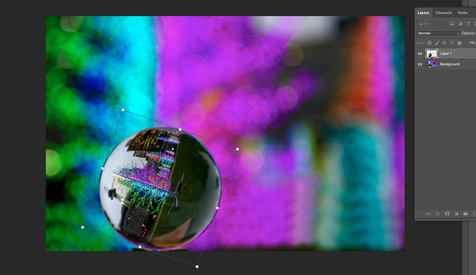
|
Canary Wharf Lights Installation rotated image using elliptical tool
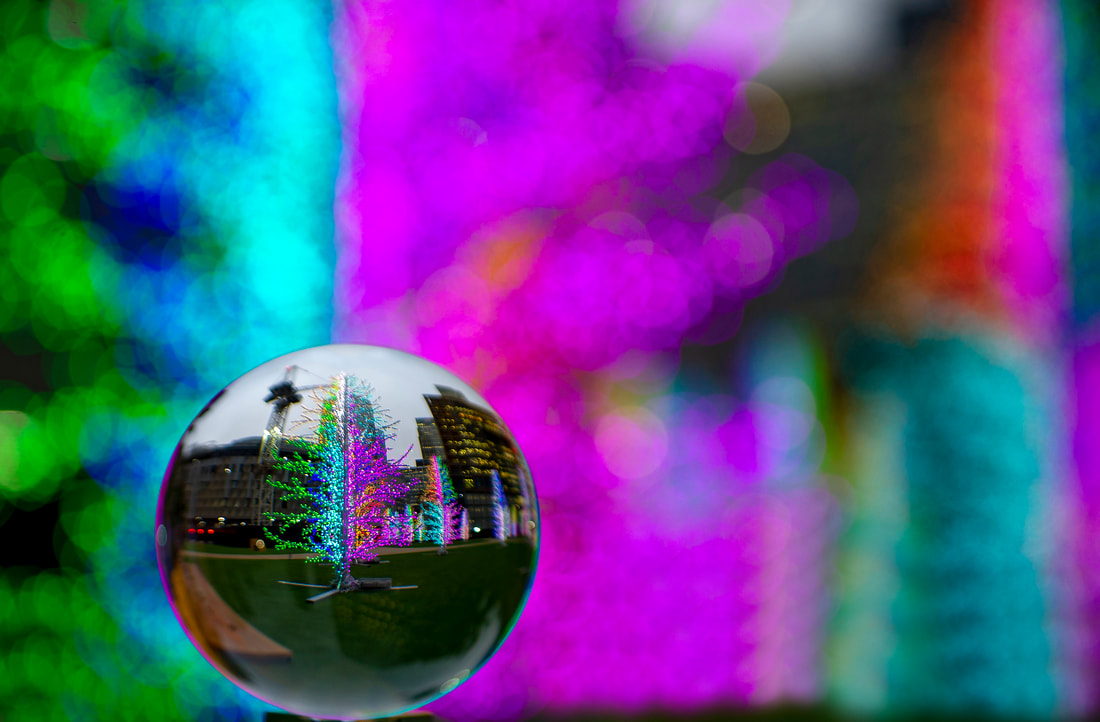
Canary Wharf Light Installation Final Edit
For the third and fourth enlargement, I wanted to make my photograph more imaginative and creative than just taking a wide view of the lights. I shot the illuminated Christmas trees at an outdoor art exhibition close up with a 70mm zoom lens so that there was a lot of colour in the background from other trees that had been decorated. My Christmas tree in the lensball looked good, but as it was upside down, looked slightly odd so I rotated it upright using the elliptical tool in Photoshop. This was the only portion of the picture I changed. I particularly like the way the top of the tree points towards the edge where the pink and blue colours meet. As I chose a longer lens and shot the image close up, all the background is blurred and creates an effective backdrop to show off the image captured in the lens ball. Unfortunately, a construction crane can be seen in the image, but apart from that I thought it was a good attempt but I need to pay particular attention to everything that may be shown in the lensball image
The Shard from Southbank
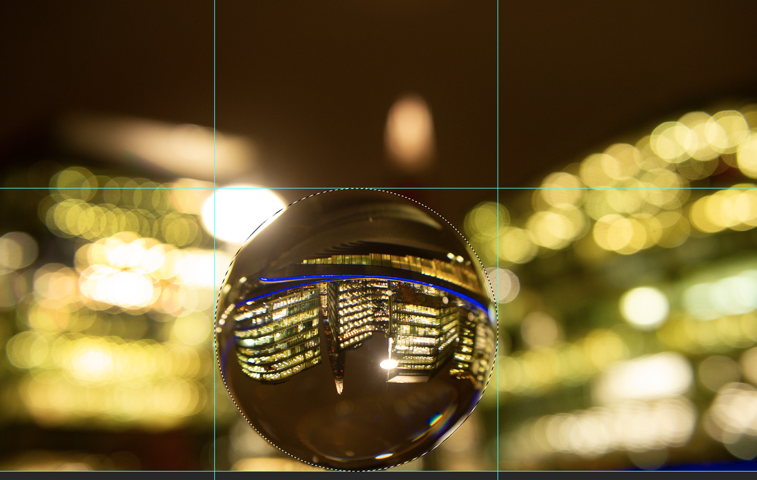
|
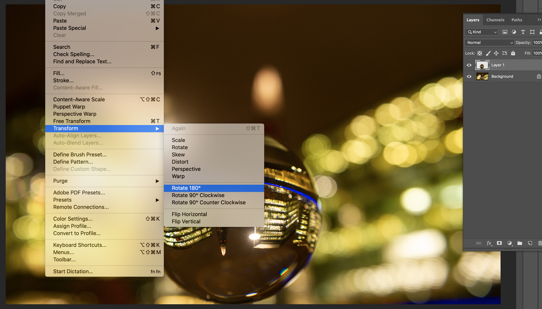
|
Rotating Lensball Shard image
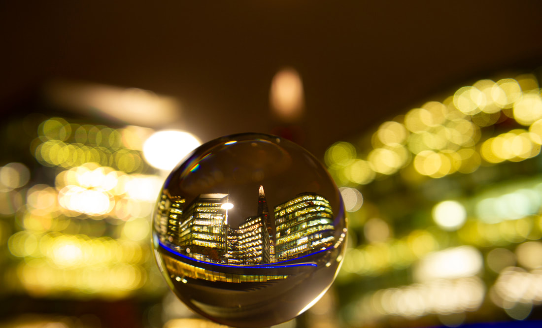
Shard Lensball Final Edit
For my fifth enlargement featuring the tallest building in the UK, The Shard, I feared that as it is so dominant and that, due to past photographic attempts, its office windows may not be illuminated, there would be too much darkness to make an attractive image - just a solitary tall building only partially lit up. However, the use of the lens ball with my wide angle lens enabled me to get close to the surrounding buildings which had plenty of light and filled the lens ball with The Shard in the centre. I like the fact that at first glance it is not obvious what you are looking at, but once looking closely and recognising the distinctive illuminated top of The Shard, you become aware of what the photograph is showing. It is a nice crisp image with all the image in the lens ball in focus.To complete the final composition I thought I could improve the original inverted picture so, using the elliptical tool again I rotated the glass ball image (see above).
Tower Bridge
|
|
Tower Bridge Exposure Compensation
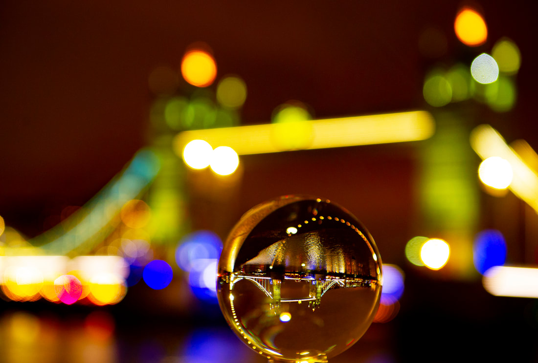
Tower Bridge Final Edit
The Thames Walkway offers a great view of Tower Bridge at night. Putting the lens ball on the adjacent wall I could get the iconic Victorian structure perfectly framed by the lights that go along the river within the sphere. Even though the main part of the picture is out of focus, its unique design, with the two towers and sloping supports the bridge becomes familiar again. The colours, particularly the blues, work really well, ensuring some nice bokeh. Composition works well with the ball being perfectly in the centre of the bridge. For this picture I did not think it was necessary that the lens image had to be rotated as the reflected curved Walkway lights in the sphere led your eyes to look at the bridge and then see the sharper, smaller image. This was very much like a Bond image in that it was slightly abstract rather than a detailed Paul Reiffer attempt with the ball. Some basic Photoshop adjustments to the exposure had to be made in the lensball image as the light was so low because of the distance from the bridge. Focussing was very difficult on this subject.
I am pleased with my first attempt at this as I made some colourful interpretations of the idea of 'glass ball photography' where the background was reversed onto the sphere and became distorted. Trying different apertures really affected the large background image. It was interesting to see how an out of focus image can still be interesting to look at if exposed well and colourful. I will next be visiting Southgate Tube Station with the hope of exploring how colourful streaks from moving cars affect the lensball.
|
Southgate Tube Station
|
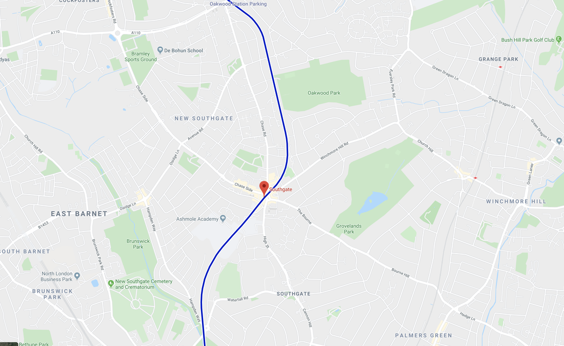
|
Enlargements
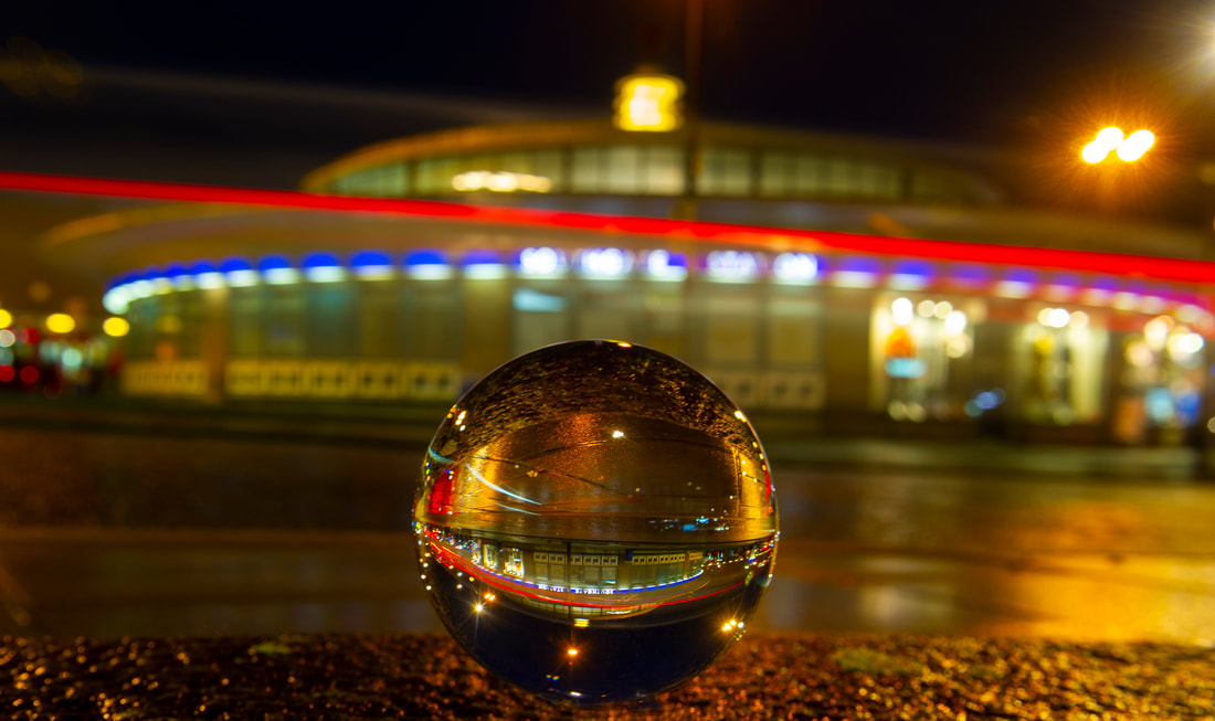
Southgate Tube photographed from the pavement
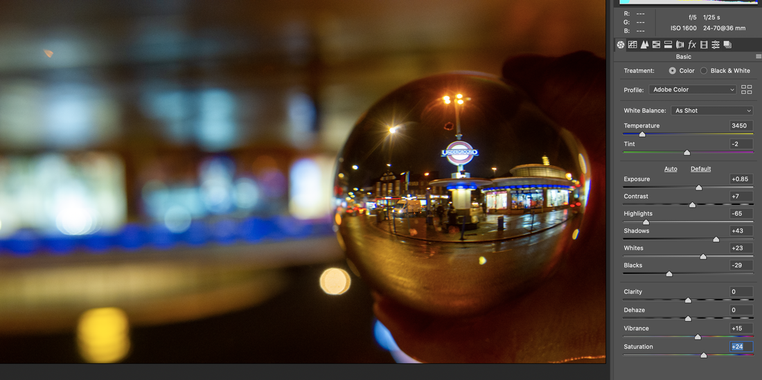
|
|
Rotated Southgate Tube Station Sharpened and Saturated Adjustments
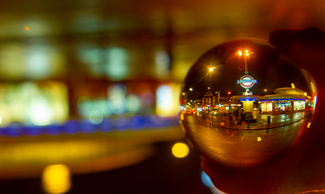
Rotated Southgate Tube Station Final Edit
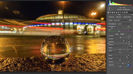
Southgate Tube Station Colour Adjustments
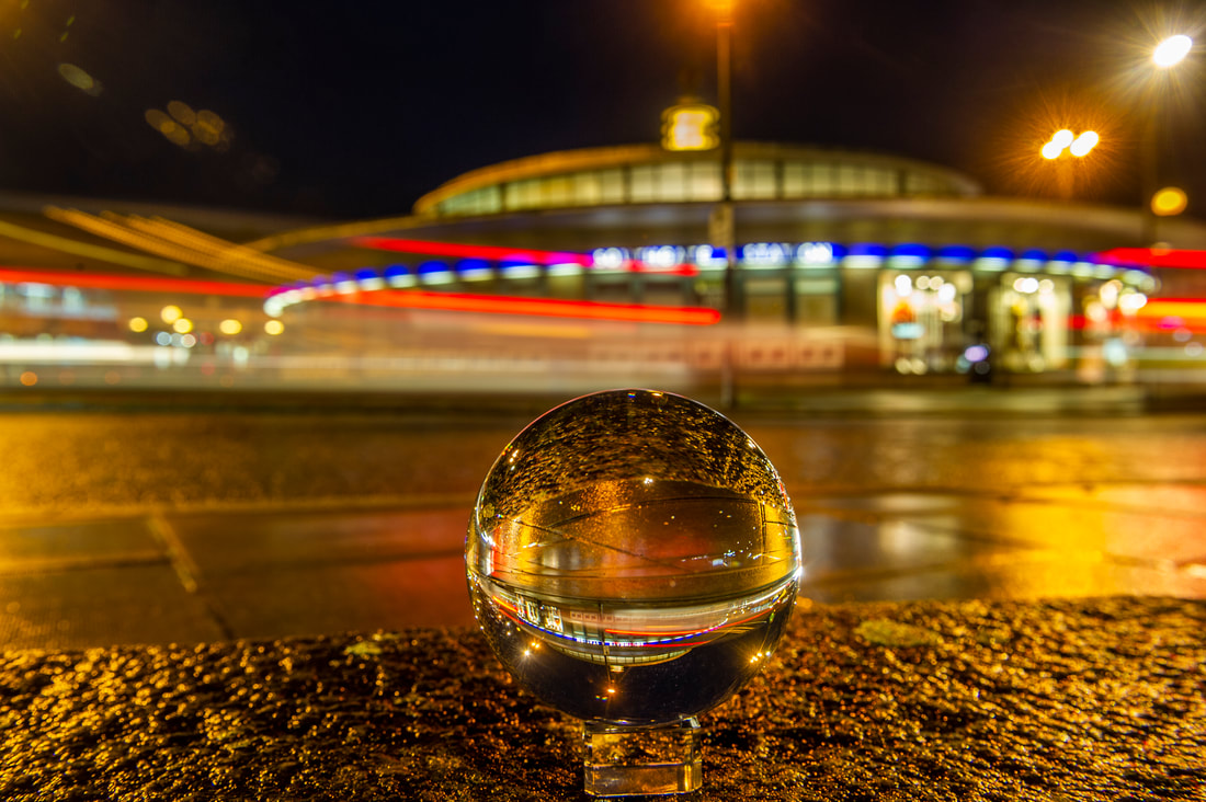
Southgate Tube Station with Light Trails Final Edit
My second attempt was to see if i could catch the tail lights of cars recorded in the ball and how it may look. At Southgate Tube Station on a busy night I set the ball up as best I could to show the cars travelling around the brightly lit Art Deco building. This is a famous tube station due to its unique design featuring an illuminated Tesla coil on the roof, making it look like an alien space ship. I photographed the cars on 5 second exposures on a 24mm lens to catch the moving lights as they passed by. It looks quite effective but the ball is really just a little too far away and the resulting image too small. It just was not safe to move the ball any closer to the cars and if I had used a longer lens, the background would be completely out of focus. Unfortunately, the principle of trying to use the lensball to enhance the original picture did not really work out in this case, although the sweeping Streamline Moderne curves of the tube station look interesting in the smaller image. I think the best image from this contact sheet was holding the ball pointing it at the Underground sign then rotating it so the letters were the right way up, similar to Simon Bond photographs.
This project has shown me how experimenting with the ball position at the location and which lenses used, can produce impressive pictures and that you cannot completely know how things will appear until you see the two images in the camera view finder.
This project has shown me how experimenting with the ball position at the location and which lenses used, can produce impressive pictures and that you cannot completely know how things will appear until you see the two images in the camera view finder.
Millennium Wheel
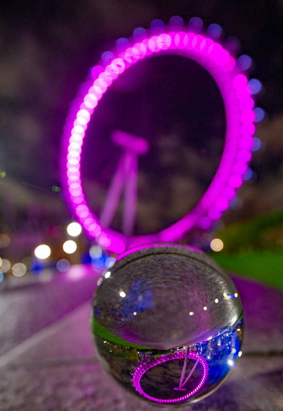
Millennium Wheel Final Edit
The distinctive coloured lights from The London Eye (Millennium Wheel) and its circular shape looked good in the ball, however just a bit too small. I was unable to get closer to it because of its size. I could not position it how I intended within the wheel itself but it showed how important the positioning of the ball is when taking an image. Too far away and the scene in the ball is just too small, but too close, it then becomes too dominant.
Contact Sheet 2
In order to enhance and experiment more with Reiffer and Bond's work, I went to Central London locations that were brightly lit, starting at the carousel on the Southbank and then Albert Bridge in West London.
In order to enhance and experiment more with Reiffer and Bond's work, I went to Central London locations that were brightly lit, starting at the carousel on the Southbank and then Albert Bridge in West London.
|
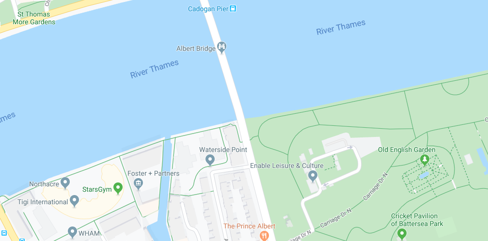
|
|
A carousel (derived from French carrousel and Italian carrosello) is an historic amusement ride consisting of a rotating circular platform featuring brightly painted wooden horses. They are moved up and down by gears to replicate the the motion of a horse galloping, accompanied with light-hearted circus music. What made this such an ideal subject for this part of the project was its abundance of brightly coloured red and yellow lighting. I would like to think that this will assist with the overall visual aesthetic of the image and make the glass ball shine.
Source: Wikipedia |
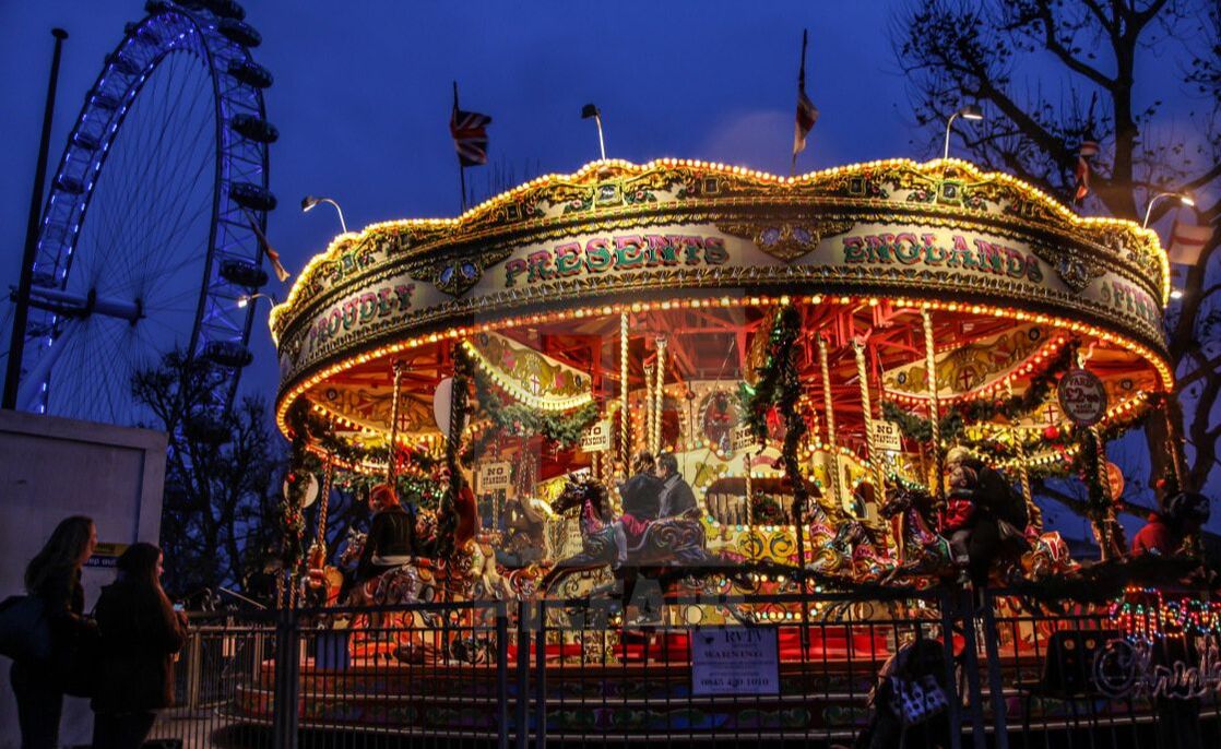
|
|
Albert Bridge is a road bridge (built in 1873) over the River Thames, connecting Chelsea on the north bank to Battersea on the south. It was improved in 1887 by incorporating the design elements of a suspension bridge and then in 1973 into a simple beam bridge, making it a hybrid of three different styles. It is so remarkable and well suited to my interpretation of 'glass ball photography' because at night it is illuminated by 4,000 LEDs. This will make my images much more abstract and eye-catching, adding to the quality of my pictures.
Source: Wikipedia |
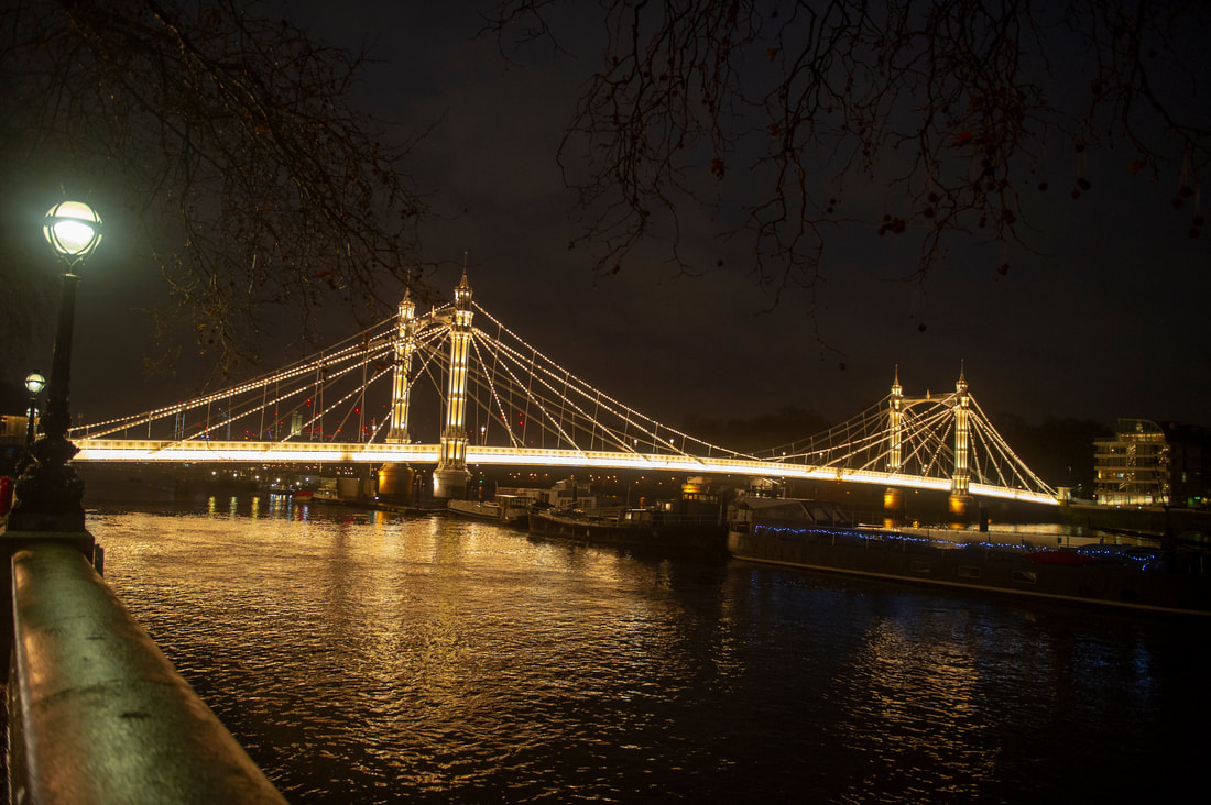
|
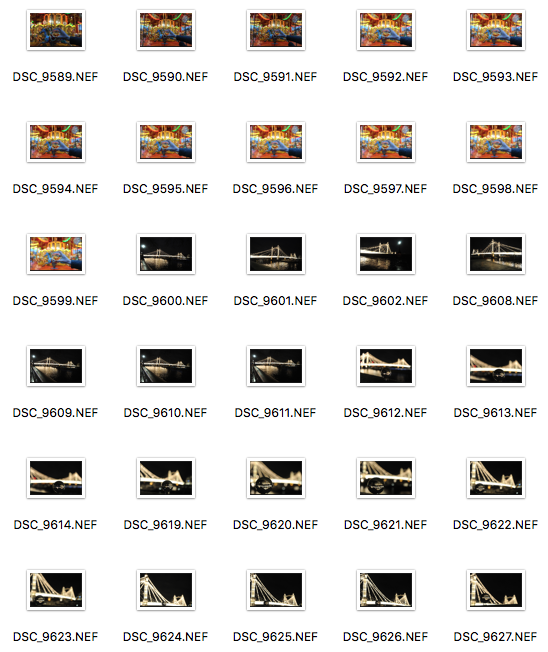
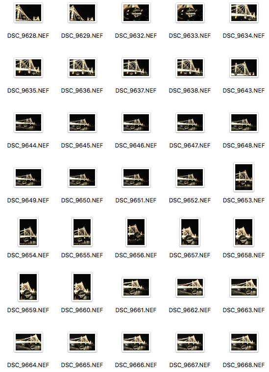
Carousel on Southbank
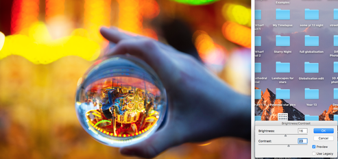
|
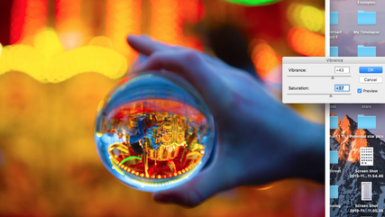
|
Carousel Vibrance Adjustments
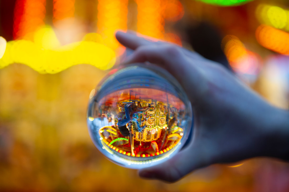
Carousel reflected in the Lensball inspired by Simon Bond techniques
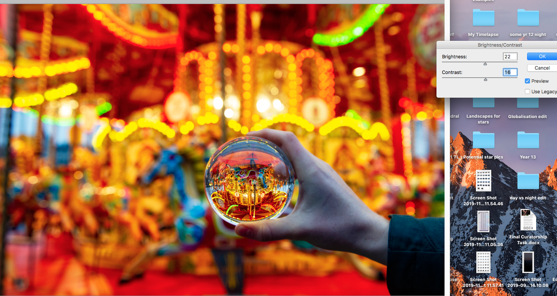
|
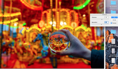
|
Second Image of Carousel Vibrance Adjustments
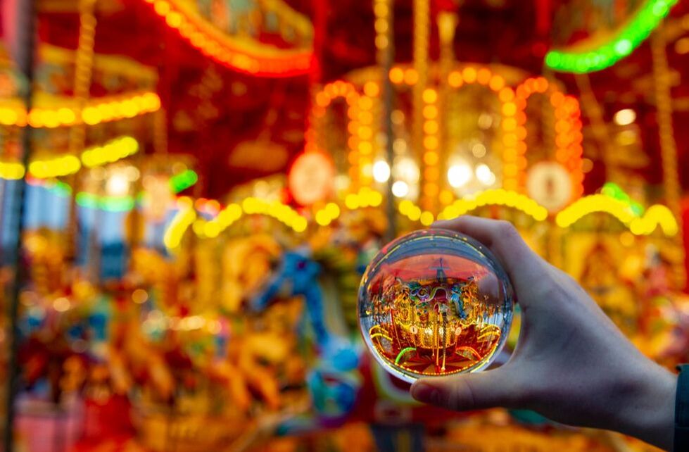
Carousel reflected in the Lensball inspired by Paul Reiffer techniques
Albert Bridge
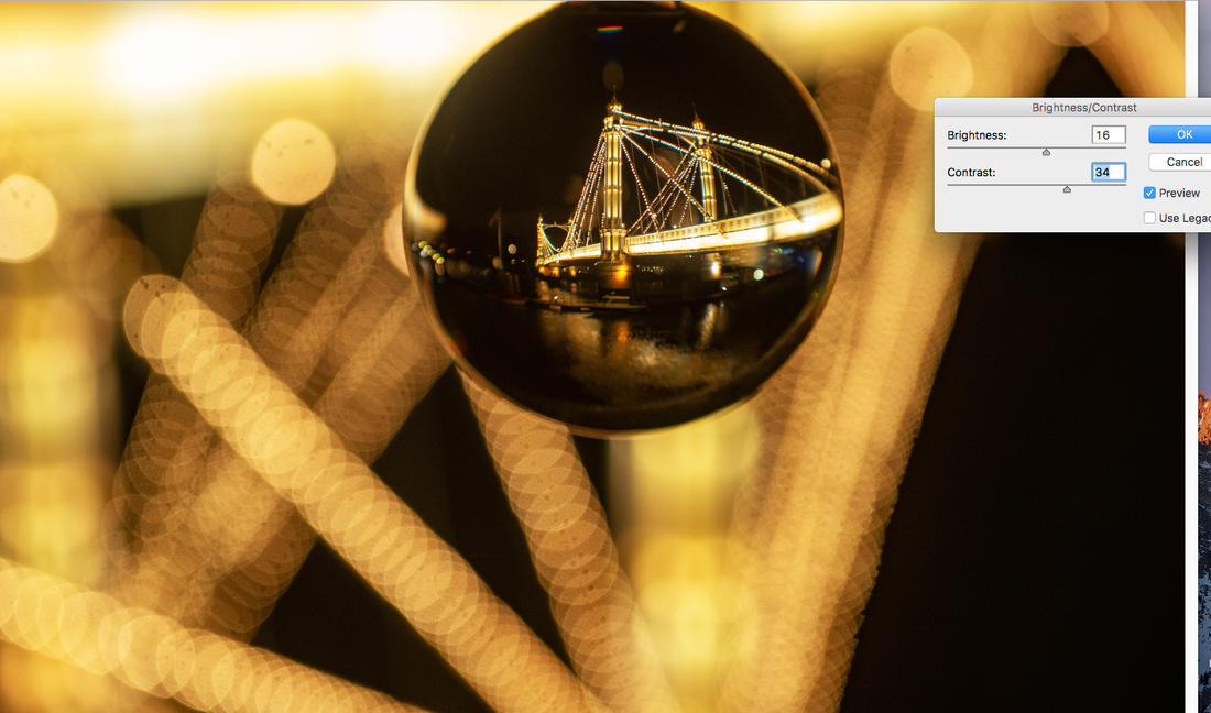
|
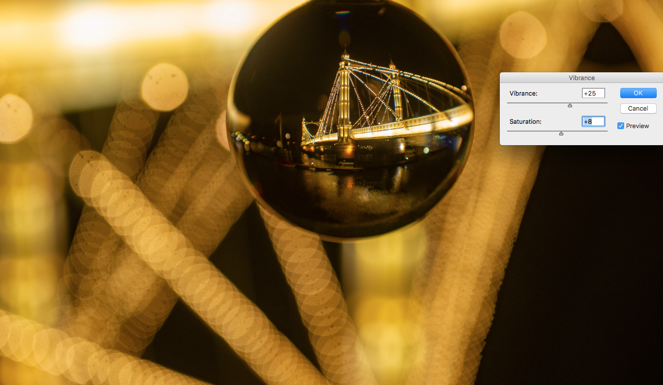
|
Albert Bridge Rotated with Colour Saturation Adjustments
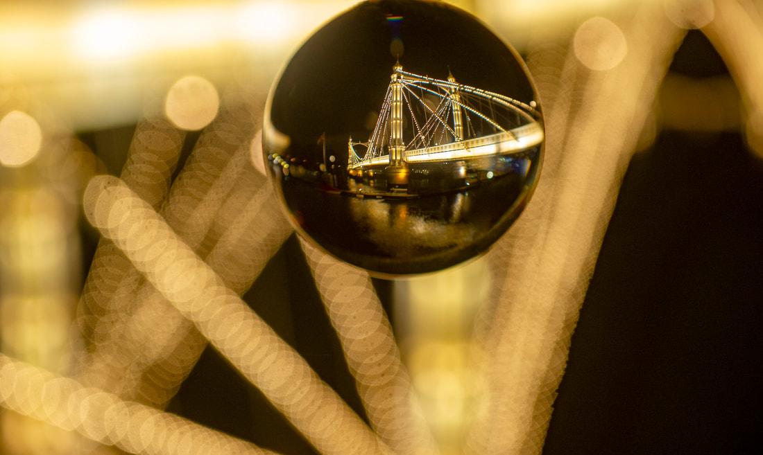
Albert Bridge Final Edit
|
|
Albert Bridge Inverting Lensball Image
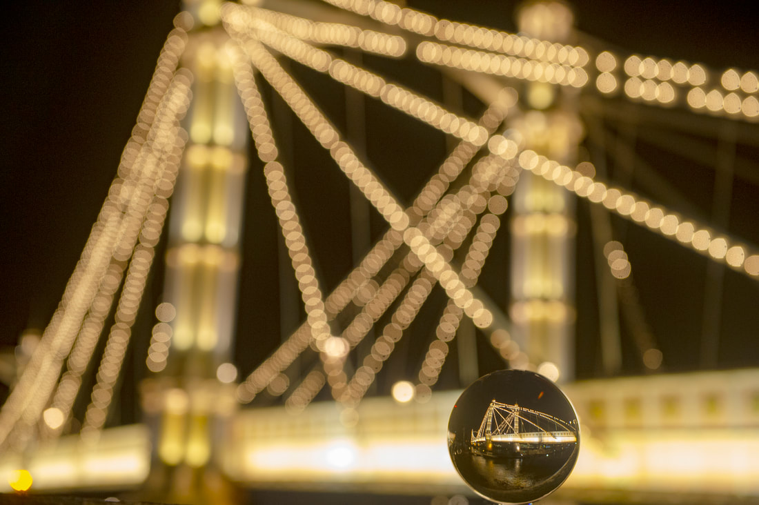
Albert Bridge Wide Shot Final Edit
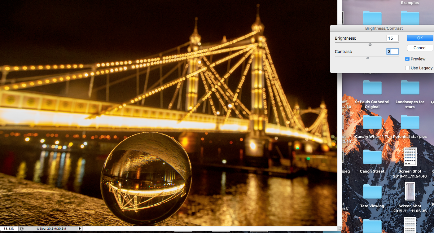
|
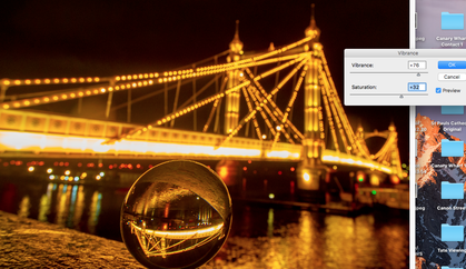
|
Albert Bridge Colour Saturation Adjustments
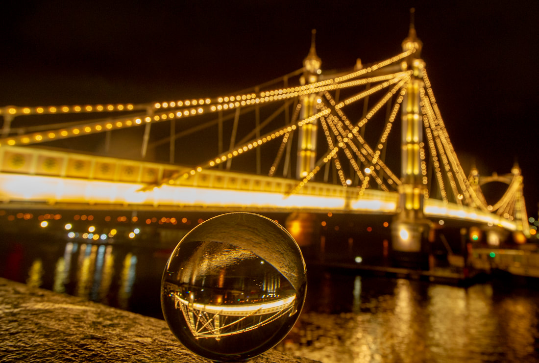
Albert Bridge Wide Shot Image No.2 Final Edit
Evaluation
For my final set of pictures I continued to experiment with the ideas of Bond and Reiffer. Using the brightly coloured fairground carousel I tried both techniques - singling out the ball image and using it as part of the whole scene. I think the most interesting image was the Bond-inspired isolated version, with the background thrown completely out of focus
I think the best result was at the brightly illuminated Albert Bridge in Chelsea. Concentrating on just the ball, I could render the background out of focus and the light bulbs on the bridge produced interesting shapes similar to the pictures taken by Bond. On some of the pictures I was pleased as the flow of the light took the viewer into the ball to see the secondary image, and also how the light ball did not visually interrupt the bridge but the very top of the sphere just touched the lower level horizontal lights. Using the tripod was essential in such low light conditions to get the images sharp. Shooting at night time when the only available light is reflected from a "source-object" meant that I needed brightly lit scenes for it to be most effective. Again, the positioning of the ball was important because the bridge is so bright that unless the ball is close to it there is a huge range in exposure between the small image in the lens and the bridge - the smaller image appears too dark.
This project has shown me how experimenting with the ball position at the location and which lenses used, can produce impressive pictures and that you cannot completely know how things will appear until you see the two images in the camera view finder.
Final Pieces


